

Your profile photo says a lot about who you are. There’s research to indicate that people judge you by your profile pic, so if you just uploaded a random image, you might want to rethink your photographic introduction to the world.
“People do not study profiles to make a fair and informed decision. They spend a few seconds and make a snap decision,” says marketing guru Guy Kawasaki. “The important ramification is that your profile must convince people that you are likeable, trustworthy, and competent—or at least not cause them to ignore you in approximately five seconds.”
Thankfully, there are plenty of suggestions from studies and photographers on how you can make a more presentable profile pic for Facebook, Twitter, LinkedIn, or any other network.

The zeroeth rule, the one thing that every photographer, study, and survey agree on, is that the profile picture is all about your face. Make sure your face fills the frame, and make sure it looks like you do in real life. Even if you are making a holiday-themed profile, the face is what matters.
How much of your face and body should show? Buffer says head-to-shoulders is the ideal length, but you can go head-to-torso if you want. Don’t do something in between, or anything larger.
Veteran photographer Peter Hurley says a good profile photo is all about the eyes and the jaw. The jaw frames your face, while your eyes are what the viewer is automatically drawn to. Concentrate on those two elements.
For the eyes, Hurley recommends a technique called “squinching”, to make you look more likeable, confident, and influential. It’s not the same as squinting! In a squint, you narrow your upper and lower eyelids, right? In a squinch, you only move your lower eyelid. Bring the lower eyelid as close to the pupil as possible. Yes, your upper eyelid will involuntarily move a little, and that’s okay—just don’t voluntarily move it, or you’ll turn it into a squint. Watch Hurley’s video, practice it a few times and you’ll get it right.
For the jaw, Hurley recommends bringing your head towards the camera. “Put your forehead out (towards the camera) and down,” Hurley says. This gives a defining jawline, instead of showing the fat around your neck. The idea, in a nutshell, is for your skin to be pulled towards the jawline, leaving out any flaps.
Couple these tricks with the basics of taking self-shots, and you’re on your way to a kickass profile pic.
Should you smile and laugh or play it cool and grim? Should that laugh show your teeth? Profile photo testers PhotoFeeler surveyed over 800 photos and found that the smile had major impact.

According to the survey, a smile with visible teeth makes the person look more competent, likeable, and influential. A closed-mouth smile is half as likeable.
A laughing smile makes you look even more likeable, but it drops how competent and influential you seem. Keep this in mind if you are building a professional Facebook profile.
More importantly, the survey notes that profile photos with no smile were judged as less competent, likeable, and influential people, than average.
Kawasaki recommends that your profile picture should focus on your face, and nothing else. You don’t need your dog or your better half or your hobbies in there. But to showcase those aspects, make a custom cover photo.
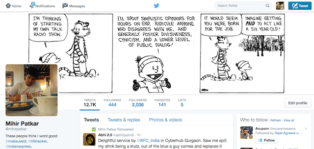
While his advice was in the context of Google+, it actually applies to all social networks, since every service offers a one-two combo of a profile photo and a cover photo. So make the profile photo about you, and the cover photo about who you are.
“Use these spaces wisely to tell the visual story of who you are and give people a reason to follow you. Or not,” says Kawasaki. “Showcasing one of your hobbies or passions allows people a glimpse into who you are and what circles they could add you in.”
We’ve established that your face should be the focus of the profile picture, but what about the rest of the space in the photo? Background is important too, after all.

Scott R. Kline, commercial portrait and headshot photographer, recommends a neutral background. “I prefer a black or white background for the photo. Other colors can work too,” he says. “Make sure there is contrast to separate you from the background. Avoid busy backgrounds like words, complex geometric shapes or lines running through your head. Solid white or grey are hardly ever a problem when your face is well lit.”
Marketing expert Rand Fishkin advises using a bright background with a unique color, which contrasts with your face. He used a bright orange, and eventually switched to green, but the idea is to get your profile picture to pop out in a crowded social timeline, while still highlighting your facial features.
It’s easy to edit the background with apps like Canva, which has plenty of social media tools built into it.
Want to know what people will think before you publish your photo? PhotoFeeler lets you survey strangers to find out how your photo will be perceived.
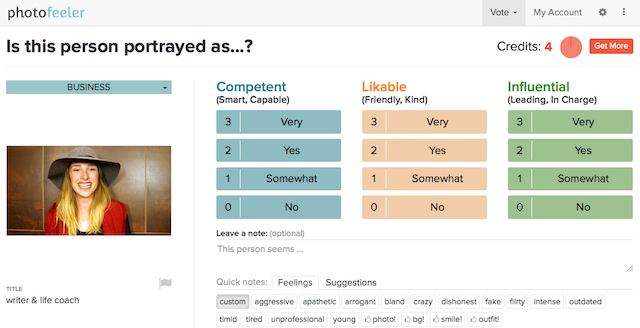
You can log in and use your current Facebook or LinkedIn photo, or upload a new one from your hard drive. PhotoFeeler works on “credits”, and the accuracy of your results will depend on how many credits you are willing to spend. To earn credits, you need to participate in surveys and rate people based on whether it’s a business profile, a social profile, or a dating profile. It’s a quick and easy process, and once you earn 10 credits, you can create your own similar survey.
If you want to skip strangers and find out what your friends and family think, use one of the best free online survey tools. It might come across as a bit too vain, though.
Do you have only one profile picture that you use on all social networks? Experts are split on that. Some say it’s best to have on picture so you are identifiable anywhere; others say you a professional LinkedIn photo might not serve the warm feelings you want to convey on Facebook. What do you think?
Image Credit: Asier Romero via Shutterstock.com


 How To Remove 30 FPS Cap For Batman: Arkham Knight on PC
 Destiny: The Taken King How to Unlock the Sunbreaker Subclass
 Final Fantasy XV Episode Duscae: Cherished Frogs Location Guide
 After Using Project Fi for Three Weeks, This Is What I Found
 Playing Video Games Will Make You A Better Person. Here's How