

At the most recent GDC, Diablo III art director Christian Lichtner spoke on the key design philosophies that helped take a beloved franchise into the era of high definition 3D graphics.
The most important principle underlying Diablo III's visual direction, Lichtner said, was legibility. A good art team understands that their role is to help make the player's job as easy as possible. Important gameplay elements need to be conveyed as quickly as possible, allowing players to understand and react without unnecessary confusion.
Characters and enemies need distinctive silhouettes and unified aesthetics. Environments need to be visually engaging without being overpowering, acting as a canvas on which gameplay can shine. Of course, it certainly helps if things look cool, and Blizzard has certainly made sure of that as well.
Read on to see shots from the presentation, showcasing exactly how Blizzard utilized these design principles to craft Diablo 3, along with some never-before-seen concept art from the game.
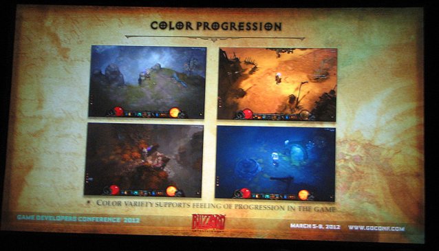
Each of Diablo 3's areas has a distinct color palette with a single dominant hue. The changes in color help to convey a sense of variety and progression as the player works through each of the game's four acts.
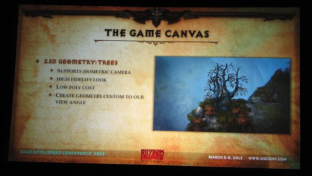
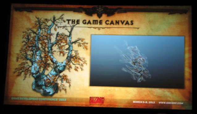
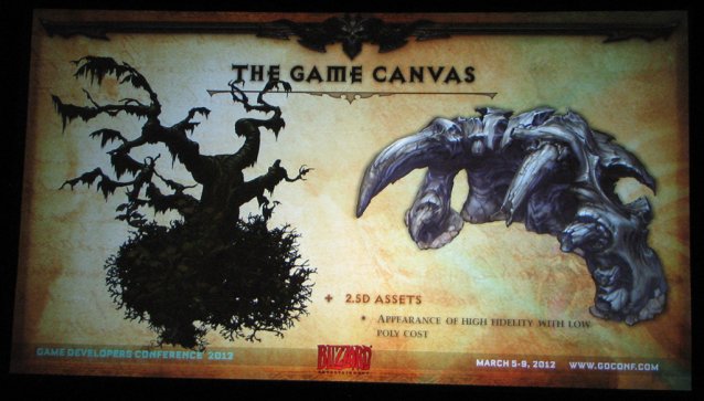
Interestingly enough, Diablo III owes some of its graphical prowess to its isometric overhead perspective. Since the camera angle remains the same throughout the entire game, Blizzard was able to develop special 2.5D models that look amazing with very few polygons.
You can see an example of this technique in the below shot of a tree. It looks fully 3D from the intended vantage point, but as soon as you shift the angle you can see that it's all a clever optical illusion.
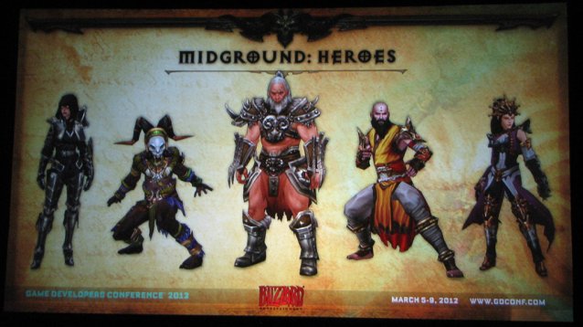
Each of Diablo III's five character classes was meticulously designed to have a distinctive silhouette and visual aesthetic that matches their play style. Readability is key here, as players need to be able to instantly recognize what characters are on screen and where.
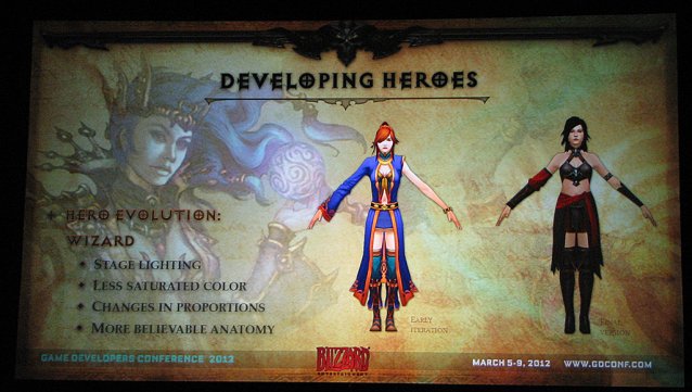
This slide shows the iterative process behind the Wizard's design, noting some of the changes the character model underwent from early stages to the final version.
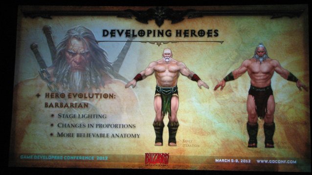
Another before and after, this time with the Barbarian. The more things change, the more loincloths stay the same.
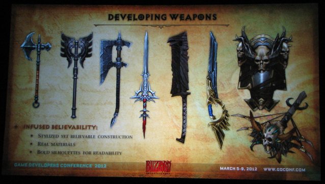
The same basic design principles also apply to the game's weapons. Each weapon type needs to have an easily readable silhouette, even though different flourishes can help to distinguish individual weapons.
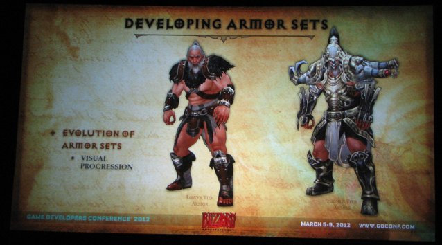
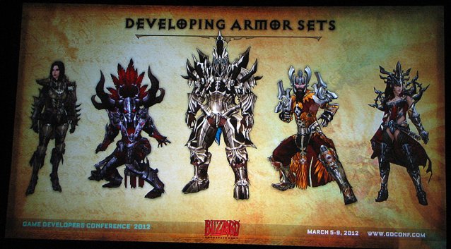
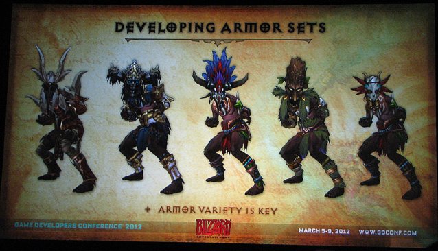
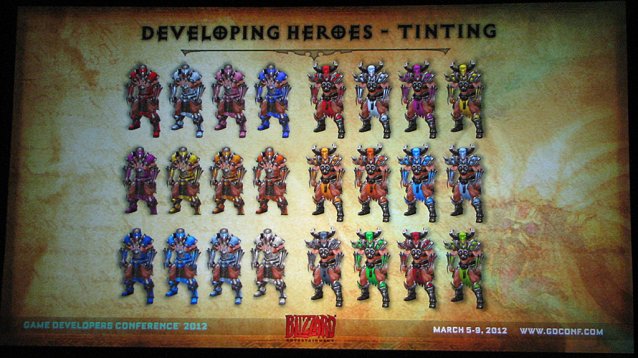
Armor sets present an interesting challenge, as they can cause dramatic alterations to the character's silhouette. The important thing is to keep them aesthetically grounded and alter the silhouette in a way that draws attention to each character's most distinctive features.
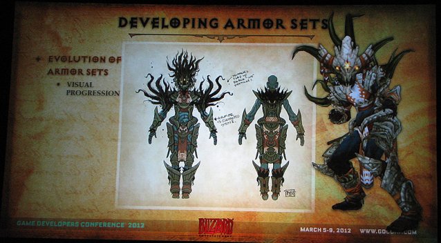
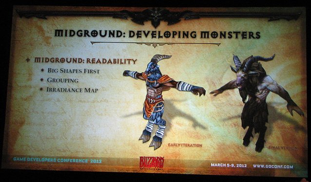
Readability is just as important for monsters as it is for heroes, as the player needs to be able to instantly recognize what they're up against and plan their attack accordingly.

Page 1 Page 2

 Far Cry 4 Wiki – Everything you need to know about the game .
 Ultimate Tips and Tricks To Survive Realistic Mode In Call of Duty: Black Ops III
 When Is It Better To Choose Web Apps Over Native Mac Apps?
 How to Manage Windows Update in Windows 10
 Troubleshoot: FIFA 16 Crashes or Doesnt Load / Work