What makes a game's visuals truly great isn't just the graphics, it's the game's aesthetics – the artwork that gives a game its appearance and identity. How a game makes us feel when we look at it is more important than what resolution it runs at. Graphics come and go. What's hot today is cold three years from now. Aesthetics are timeless – they're the creative engine that drive how a game feels.
Here are five games with great aesthetics.
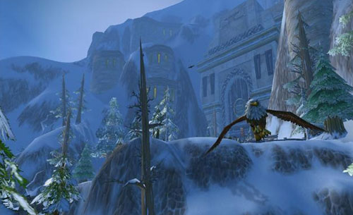
WoW has practically lived and died off of its art. Well, mostly lived. And that's mainly because of it's ability to retain the great quality of its art on a variety of graphical settings. Which means that no matter what your system specs, you'll still get that great Warcraft feel. But, what WoW really does well is this: from zone to zone, there are so many different moods telegraphed by Blizzard's spectacular art department. For instance, Elwynn Forest is lush and inviting. It feels like a safe-haven - somewhere to carry out as happy a living as is possible in a perpetually war-torn world. There's a lot of green everywhere, and warm, light colors like splashes of yellow, red and blue.
In contrast, The Barrens are rugged, dry and dangerous. You can almost feel the sun beating down the crown of your head, cracking and peeling the skin on your shoulders. There's a lot of yellow and brown – colors that are typically used in video games. But what sets The Barrens apart from the innumerable other examples that use similar palates is Blizzard's ability to sneak other colors in without ruining the mood. Look around the barrens and you'll see a couple small oases (composed primarily of green and blue) there are some large hills which are the color of red Georgia clay, and various wildlife that are an amalgamation of orange, purple, green and brown, among many others.
World of Warcraft, during the classic era, is the single best example of Blizzard's mastery of color. Even to this day, their ability to create a setting through use of color is nearly unmatched.
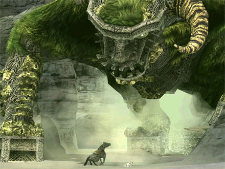
If games are the evolved descendants of film, Shadow of the Colossus is the missing link. There is no game that is more cinematic in presentation than this one. The aesthetics in this game seem to have been heavily influenced by Hayao Miyazaki's Japanese animated films like Princess Mononoke (perhaps the fact that a main character is named “Mono” is a nod to this influence). At times it looks like Studio Ghibli's fingerprints are all over this game, as it seems like each colossus has come lumbering out of Miyazaki's most demented nightmares. What's more impressive is each one is artistically distinct from the others, while maintaining a unified color palate between all of them – not an easy thing to do.
As bright and colorful as Miyazaki's work at Studo Ghibli is, Shadow of the Colossus is every bit as dark and moody – everywhere there are hints of a ruined civilization, creating the feeling of foreboding while exploring the Forbidden Land. All the while, the undercurrent of life-altering adventure that permeates throughout Miyazaki's body of work is also present in Shadow of the Colossus. While the art of the game plays a large part in this, the cinematography in this game is leagues beyond anything else in any other game. I dare you to look at nearly any landscape in Shadow of the Colossus and not be awestruck by the beauty and scale looking back at you.
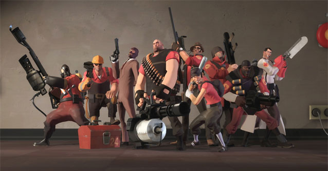
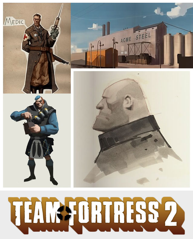
Team Fortress 2's aesthetics most notable feature are the aggressive use of shapes. The way Valve created each character class with a unique profile for easy identification was a stroke of genius – and it changed the debate surrounding useful presentation of information in games. Rarely before had gaming message boards talked about something like a “unique profile” for a particular character, or class. But once TF2 came out, and Valve explained exactly how they conditioned players to subconsciously recognize the difference between a Medic and a Soldier in a split second, it all became so obvious. Suddenly, artists and developers across the industry are talking about the importance of giving each character a unique shape.
Also, like Shadow of the Colossus, Team Fortress 2 has a distinct influence from a particular film. Ever notice how the Heavy has a strange likeness to Mr. Incredible from The Incredibles? There's a reason for that. Valve has admitted before that the music and art in TF2 was swayed by a love for Pixar's stylish 1950's spy-meets-superhero tale – and if imitation is the sincerest form of flattery, Pixar should be blushing.
But that's not to say that TF2 ripped off of the Incredibles – because it doesn't. It take its influences from that movie and brings it up to the next level. Every character has personality through their movements, and through the various colors applied to them. You almost get a feel for the Demo's inexplicable love of bombs by looking at his outfit – you can tell that the Scout is a hot-head just by looking at his face.
Valve could run a masterclass on stylized art in video games (I really wish they would), because they're able to create personality through art in nearly every single game they've produced – Team Fortress 2 is just the best example of it.

Page 1 Page 2

 Lego Marvel Superheroes Deadpool Bricks Guide
 Destiny: The Taken King Guide - How to Open the Chest in Taken Consumption Room on Dreadnaught
 OlliOlli2: Fix problems with cross-save on the PS4
 8 Free Endless Runners For Windows Phone 8
 Earth Defense Force: Insect Armageddon Walkthrough