

Mage Knight: Destiny's Soldier fails, even for fans of the tabletop Mage Knight strategy game. A simple dice game has been reduced to a convoluted mess of menus and drunken stylus controls. The inaccuracy of stylus input is the most infuriating aspect of waging this turn-based, grid-mapped medieval war, enough to weigh down whatever positives the game might manage to sneak through.
Tap a unit in your Lord of the Rings-style army and its action menu comes up; drag a unit and it moves to whichever hexagon slot you've dropped it in. Fine in theory, but the DS has a hard time telling the difference between a "tap to begin dragging" and a "tap for menu access." It also has a hard time reading exactly where a drag motion ends, placing units close to the correct place but not quite there. Rotating the units to face the direction you want them is incredibly important to the battle system, but difficult thanks, again, to the dodgy stylus interface. Yes, you get the hang of it, but should you even have to?
If you're not familiar with the Mage Knight rules, you've got an uphill battle right from the start. Soldier provides a rather bare-bones tutorial, and the nuances are left for you to piece together - the instruction book helps a little, but almost any other turn-based RPG on the DS does a better job of teaching you the ins and outs.
Beyond the mechanical issues, two items glare out, daring you to try to like the game. There is no way to compare the dozens of units side by side, with their complex, fluid stat charts. Bring up one unit, read it, bring up the next, read it and repeat. How do you know if this walking tree is cooler than the other guys in your crew? We suggest just basing it on how badass the Game Boy-caliber character art is. Seems to work just fine.


 Spikes VGAs 2011 Recap: How It All Went Terribly Wrong
 Destiny Beta: Tower Walkthrough and Vendor Guide
 Improve Privacy & Security with 5 Easy New Year's Resolutions
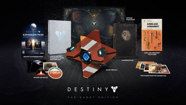 How to get Destiny Dead Ghosts locations from all Four Planets And the Tower
 GDC 2013 Preview: Tetris Blitz