

Most of us don’t get what Microsoft PowerPoint is all about.
Like any presentation tool, it is meant to enhance what the presenter is saying. It is not a tool to do all the job for the presenter.
If the latter had been true, TED Talks would have killed scores of audiences around the world. Death by PowerPoint bloodies the hands of a bad presenter.
“Your slides should be a billboard not a document!”
– Lee Jackson (Author)
A PowerPoint presentation needs to work with the creative constraints of short attention spans. Not unlike the billboards designed to catch the eyes of speeding motorists. But, PowerPoint creators have the luxury of multiple slides to make a point. And some wonderful creative tools that have become better with the enhancements in Microsoft Office 2016.
So, let’s dive into these new creative tools in PowerPoint 2016 and see how they can help you make better presentations.
Suffering from “presentation block”?
With Microsoft PowerPoint 2016, you can banish both annoyances. Any presentation starts with the hunt for a suitable template or theme. Or creating a nice one from scratch. But you may not be a designer.
Drop the first image into a fresh slide and PowerPoint Designer automatically offers several design ideas. The recommendation engine works with 12,000+ creative designs created by graphic artists.
Microsoft says:
Designer applies cloud intelligence to analyze and identify the most compelling portion of your images to determine which blueprints work best with your content.
You can also open it from Ribbon > Design > Design Ideas.
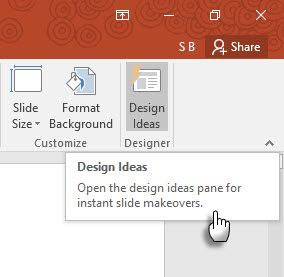
If you don’t find it useful, go to File > Options > General. Uncheck the box that says Enable PowerPoint Designer.
The time-saving assistance isn’t only about dropping a pretty graphic on a slide. Designer uses cloud intelligence to analyze and highlight the most compelling portion of your images. Try it. It’s different from our old habit of selecting a pre-made template.
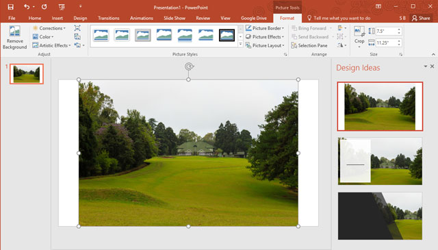
General tip – Right now, PowerPoint Designer recognizes a few simple slide types. As further updates arrive, the recommendations will get better with different slide types.
Still feel lost on the Ribbon?
Microsoft Office 2016 introduced the “Tell Me” assistant to help you navigate through the many options. The Tell Me What to Do box is located above the right side of the Ribbon. Type what you want to do in this box, and PowerPoint points you to the Ribbon button that lets you do it.
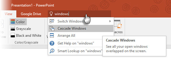
Let’s say you want to organize multiple PowerPoint windows on the desktop by cascading them. Type “windows” and Tell Me displays the Cascade Windows command (originally located under the View tab).
Tell me is a time saver and a timely confusion killer.
Looking for more information or creative inspiration?
Highlight a keyword and right-click to use the Bing-powered Smart Lookup in PowerPoint 2016 (Insights) to bring in search results from the web. A panel opens on the right with results from the web and Wikipedia.
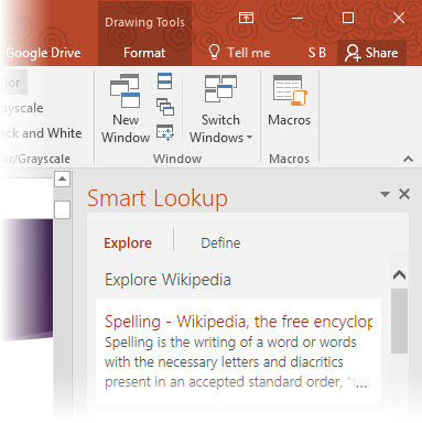
You don’t have to leave PowerPoint for looking up simple information. Make error free presentations quickly by checking the facts or the vocabulary you will use on your slides. Use it for creative inspiration or for finding RGB values of colors.
You can also use Smart Lookup from the Ribbon > Review tab.
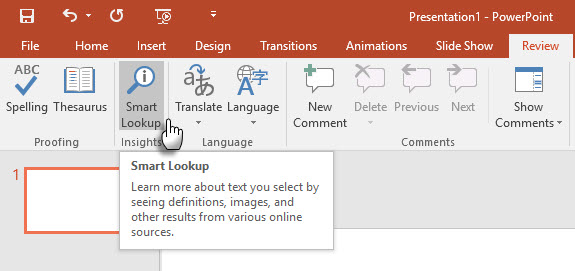
Smart Lookup is also a part of the new Tell Me feature. Enter keywords into the Tell Me box and select Smart Lookup from the dropdown suggestions.
General tip – try to avoid using it for image searches. Finding images to insert with the right Creative Commons license is almost impossible via the search pane.
Remember the struggles with math on the slides?
Working with math equations is easier in PowerPoint now with both the keyboard and the stylus. From the Ribbon, go to Insert > Equation > Ink Equation. For touch-enabled devices, you can use your finger or a touch stylus to write math equations by hand. You can also use the mouse in the Write box. The Office software converts it into text.
As the Ink Equation editor brings the fight with mathematical expressions to an end, it can be an effective teaching tool if you broadcast your presentation to a remote audience. Or pair it with one of the creative uses of Google Chromecast.
General Tip — Use the Tell Me box to quickly get to the Ink Equation editor. Type Ink in the box.
Found Motion Paths too difficult to apply?
Morph Transitions in PowerPoint 2016 is designed to make animations easier. Simply explained, Morph allows you to move an object from Point A to Point B. To move objects effectively, you’ll need to have two slides with at least one object in common. An easy way is to duplicate the slide and then move the object on the second slide to a different place. You can also copy and paste the object from one slide and add it to the next.
Then, with the second slide selected, go to Transitions > Morph.
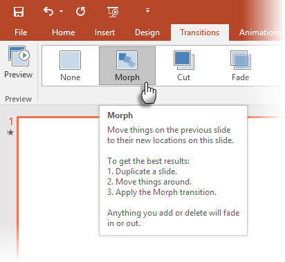
PowerPoint estimates the difference between the two slides and applies a smooth animation between them. Play around with movement and transitions. You can use Morph to move objects, change colors, shrink or zoom into a particular view.
The Microsoft Mechanics video demonstrates Morph (and PowerPoint Designer):
The direct transitions of Morph can be powerful tool to explain business processes or steps. Morph Transitions is an easier way to animate without the use of complicated motion paths. But unlike motion paths, the transition takes the shortest direct route.
For example, you cannot show the curved flight path of a butterfly with a morph transition. For more complicated animations, revert to the use of motion paths.
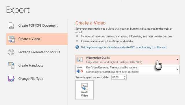
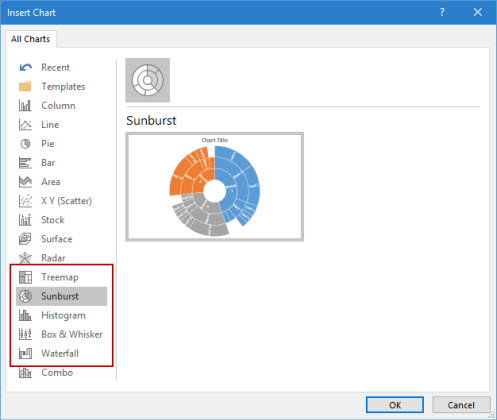
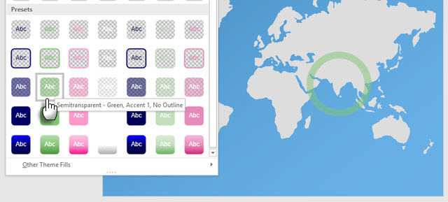
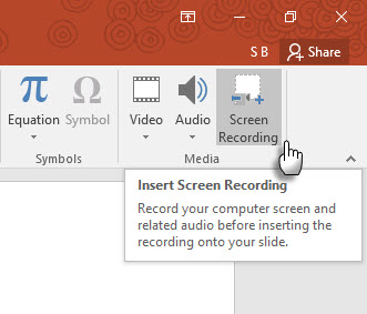
Stumped when you have to tell stories with data? Data visualization today is not only about displaying datasets. Effective visualizations send a message and help us recognize shapes and patterns. As we are wired to visualize information far faster than we can read it, using the right chart type in PowerPoint puts us at an advantage. Six new charts types — Box and Whisker, Treemap, Sunburst, Histogram, (and within Histogram options, Pareto), and Waterfall – give the presenter more flexibility. This Microsoft Office blog article shows how to use the new Treemap and Sunburst charts to breakdown hierarchical data. General Tip — For a given set of numbers, Microsoft Office allows you to change the chart types. But ask yourself why is the chart important for the audience. If possible, simplify the data and look beyond charts. Do you long for more preset shape formats? Remember how the Merge Shapes feature helps you draw your own custom shapes? The feature to save your own custom shapes is still missing, but PowerPoint 2016 gives us another incremental improvement with five more rows of preset Shape styles. Draw a shape in your slide and apply a new preset style to the shape. PowerPoint 2016 makes it easier for the creatively challenged. Access the shapes and the Quick Styles from the Drawing group on the Home Tab. Alternatively, you can also go to the Insert tab and draw a shape. This again brings up the Shape Styles under a Drawing tab. Though, you can finetune any shape with the Format Shape options, the variety of Quick Shape Styles makes creating stylish presentations a bit breezier. General Tip — The new presets with transparent and semi-transparent fills are useful for creating neat overlays over another image. Wondering how to record high-quality screencasts? There is an industry standard tool like Camtasia and then there are many lightweight screen recorders, too. PowerPoint’s native screen recording utility is a one-touch process. Camtasia takes some learning. Try PowerPoint’s Screen Recording feature with a bit of creativity and you can avoid the boring static screenshots. Go to Insert > Screen Recording. Click the Select Area button and drag across the area you want to record. Click the Record button. Use the Windows button + Shift + Q shortcut to stop the recording and insert the video on your current slide. PowerPoint gives you a whole slew of Video Tools to format and present your screencasts. General Tip — PowerPoint screencast slides are ideal for how-to tutorials and training courses. A single dynamic slide can be more effective and less time consuming than making multiple static slides with fancy graphics. If you missed a few opportunities to use Screen Recording in the updated PowerPoint 2013, it’s time to set the “record” straight now! Hate the black bars on the top and bottom of your slides? This is another little, but useful feature that continues from PowerPoint 2013. When you export your presentation as a video, you can create a file with resolution as high as 1920 x 1080 and display it cleanly on an HDTV, projector, or a computer monitor. Remember, you can also design slides with the widescreen aspect ratio of 16:9 used on such displays. If you show a slide in this aspect ratio on a standard 4:3 screen you will get black bars on the top and bottom. General Tip – Find out the dimension of the presentation screen beforehand. This could make all the difference. Can’t make up your mind on two slides? PowerPoint 2016 has beefed up the collaboration options. When two or more people work on the same slide, it can lead to two slides with a few, conflicting differences. The conflict resolution feature will pop up automatically and display the two slides side-by-side. Compare them visually, select the best one, and restore team harmony. Presenting in front of an audience is an old game. The newer features in PowerPoint 2016 won’t make you radically change the way you prepare, but make the process just a little bit easier. New features like the new Office themes are superficial and the management of version history is available only for files stored with OneDrive for Business or SharePoint. What are your favorite professional presentation tips for designing slides or giving them? Which among the new tools in PowerPoint 2016 do you see yourself using more? Write to us in the comments!Tell Beautiful Stories with Six New Chart Types
More Options with Preset Shapes
Show Them Better with Screen Recordings
Present on Larger High-Def Screens

Resolve Conflicts
Combine Old Tips with the New for Better Presentations


 Trine 3: The Artifacts of Power (PC) early access review
 Kingdom Hearts 2.8 HD Final Chapter Prologue Wiki – Everything you need to know about the game .
 Mortal Kombat X Guide: How to Play Reptile
 Final Fantasy XIV: A Realm Reborn Wiki – Everything you need to know about the game .
 Why Pillars of Eternity Made Me Love Video Games Again