

Well, this is certainly an easy review to write. You know Ocarina of Time, the most popular, successful and beloved Zelda game of all time? The one that ushered Nintendo’s million-selling franchise into the third dimension and endeared an entire generation to Link, Ganon and Hyrule? It’s all here, every dungeon, item, secret and Skulltula, now in the palm of your hand. But it’s not a hasty port – this is a thoroughly prettier and smoother experience than the 1998 original, making it the best version of this already legendary experience.
Above: As you can see, Link has received a visual upgrade
Above: It gets better – literally everything received a makeover, adding clarity and detail to previously blurry areas. Notice how you can see Death Mountain from this location in the 3DS version
I recently played through the N64 version of Ocarina of Time just so I’d have a firm understanding of the differences in the 3DS edition. For the most part, everything is identical; the script is largely unchanged, as are item locations and the memorable soundtrack. The major differences, as I’ve already mentioned, are visual. Top to bottom, this is a slick looking game, with more detailed models and more vibrant design than the fuzzy original. Furthermore, Link’s own animations are smoother, making for slightly more lifelike movements. This fluidity extends outside of Link too, so other creatures and NPCs have a tad more spring in their step.
Above: One of the few differences – the Stone of Agony (formerly an N64 Rumble Pak) is now the Shard of Agony, and blinks when secrets are nearby
The improvements don’t end with graphics and animation, however. The entire bottom screen is dedicated to inventory, which was formerly accessed by pausing the game and flipping through four pages of content. Once there, you could assign three items to the N64 or GameCube’s face buttons, meaning any time you needed to change those items (or equip different boots, shields or tunics), you had to pause and flip through all that crap again. Now, the Ocarina has its own dedicated button in the lower left corner – that frees up a slot right away. You can then assign items to the X and Y buttons, plus two additional items in the I and II slots on the touch screen.
This gives you instant access to five pieces of inventory at a given time. This alone speeds up the game considerably, but it also means you can set something like the Iron Boots to said button and simply tap it to equip and un-equip it. This simple act makes the Water Temple a far less irritating slog, as it alleviaties one of the constant gripes about that dungeon.
Above: The Water Temple also has these new color trails that lead you to key points in the dungeon. Helpful, but not babying if you’re concerned about losing your hardcore cred
Finally, a small but extremely welcome alteration is the text display speed; the N64 version plodded along very slowly, and if you hit B to skip proceed faster, it often blasted through the entire conversation instead of just that one dialog box. Now, text moves much faster, getting you in and out of long conversations more quickly. All these touches, both small and large, add up to make this the definitive version of Ocarina of Time… but that doesn’t mean it’s perfect.


 The First Templar Walkthrough
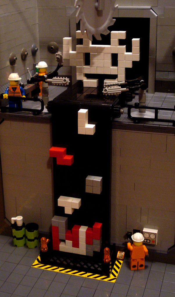 Now you know where Tetris Blocks come from
 Dragon Ball Xenoverse Guide: How to Get Zeni Quickly and Easily
 Outland Cheats
 Windows 10 Guide: How To Stream Xbox One Games To Your Windows 10 PC