

Few things factor into the decision to purchase a game console more than the controller. After all, no matter what games you choose to play, you’ll have to interact with them using the controller. Cross-platform games, like the wildly popular Call of Duty series, will play very similarly on both consoles, but the subtle differences in joystick placement, button placement, and trigger sensitivity can make all the difference.
The Xbox 360 controller was largely regarded as the best out there, easily outclassing the PS3’s DualShock 3, especially in the realm of shooters due to the clicky triggers and tight joysticks. This gap certainly narrows, if not shifts completely, with the updated Xbox One and DualShock 4 controllers.
Both are fantastic, but they’re slightly different. If your muscle memory is already tuned to an Xbox 360 or DualShock 3, you’ll be happy to know that the basic joystick and button layout remains the same, which is good if you plan on sticking with the same device, but could make switching a bit tricky. Once you get used to a particular layout, it can be hard to change.
Let us take a look at how both of these controllers have evolved from their predecessors, and then we will compare them to each other to see which might be the best controller.
There are many reasons to choose the Xbox One over the PS4, and even many great exclusive titles for the One, but it’s the refinements to the already great Xbox 360 controller that make the One’s offering so amazing. For the most part, it is largely the same controller, but Microsoft has invested over $100 million and two years of work into making hundreds of prototypes and trying to hone in on the perfect design. The changes, while seemingly minuscule, could alter gameplay for the better.
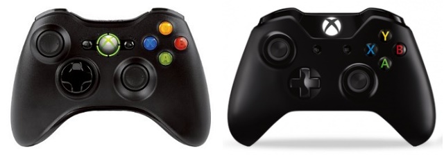
Triggers And Bumpers: The triggers on the Xbox One controller are completely redesigned. Whereas the Xbox 360 controller had straight, angular triggers, the One controller has curved triggers that are angled slightly away from the base of the controller, allowing for a more natural grip.
The bumpers have also gotten a redesign, becoming larger and moving closer to the triggers so that there is less of a gap between bumper and trigger. Hopefully this will allow for a shorter time between switching between them.
And don’t forget the impulse triggers! These are small motors inside each trigger that allow for individual vibration. These can be used to signal when you’re drifting off the road in a racing game, or which side you’re getting shot at in a shooter. However it’s used, the option to have such fine-tuned haptic feedback is awesome.
Buttons: The buttons, while visually altered to look more modern and sleek, are mostly the same. In truth, they’re actually millimeters closer than before, allowing for hardcore gamers to switch between buttons quicker, but the average gamer probably won’t notice anything.
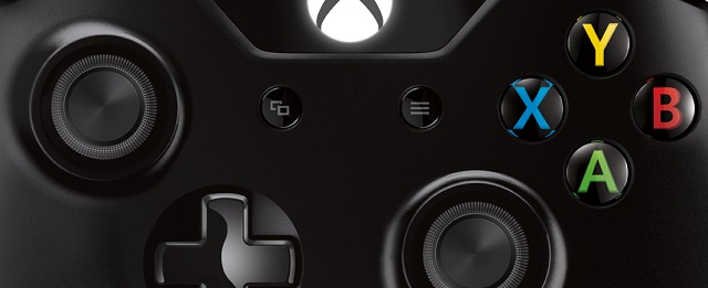
D-Pad: The d-pad on the 360 controller was bad — it’s as simple as that. It was a wobbly mess that never let you know if you were clicking up, right, or maybe up and right at the same time. Thankfully, this has been remedied with the One, giving us a simple plus sign-shaped d-pad with four distinct clicking areas.
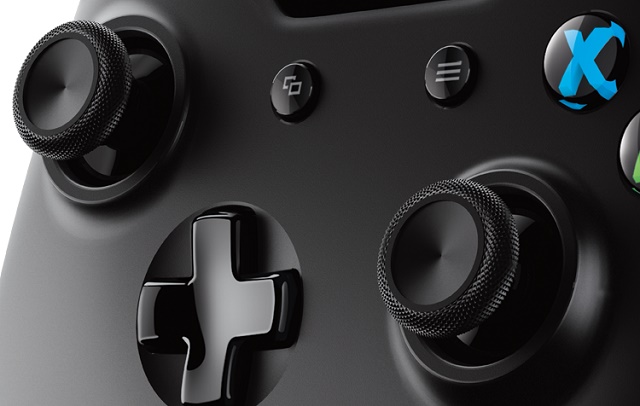
Analog Sticks: As the most abused part of a game controller, I’m happy to see an analog stick refresh here, even though I liked the 360’s sticks. On the One controller, the center of the stick is still curved in like a bowl, allowing for your finger to rest inside of it, but the four annoying dots are gone, which I had found could really dig into your fingers.
Along the outer edge is a rubberized, grippy material for allowing you to keep traction when pushing along the outside of the stick. They’ve also been loosened up a bit from the 360. Many people liked the 360 controller for its tight, precise analog sticks, but looser sticks could mean quicker movement when aiming in a shooter.
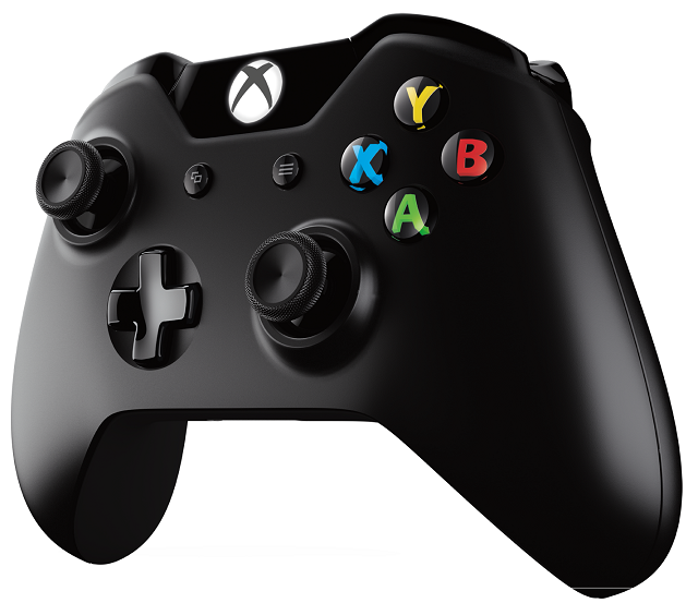
Overall Size, Shape, and Weight: In general, the Xbox One controller has become a bit smaller, leaving the curving handles and bulging battery pack for a slimmer, straighter design. The screw holes in the back of the handles have been eliminated, which you may not have even noticed until they began to dig into your palms after a few hours.
The weight distribution has changed a bit too, although the new controller weighs about the same. With the battery pack pushed inside and bit of tinkering, the weight is now more in the center and towards the bottom of the controller, allowing it to rest in your hand more than be gripped. Given the extensive testing that Microsoft has done with so many different prototypes, they concluded that this is the ideal size and weight for the average gamer.
Additional Features: The One controller, like the 360, has a proprietary headphone jack. Yes, it’s stupid, and they should have a universal headphone jack like the PS4 controller, but they don’t. Fortunately, up top is a micro USB which can be used to plug the controller directly into the console and play as a wired controller. However, as it still takes batteries, don’t expect to be charging those while you play; you’re either playing wireless with batteries, or wired by micro USB.
Additionally, the Start and Back buttons have gone the way of the Black and White buttons from the original Xbox controller: they’re gone. They have been replaced by the Menu and View buttons, both of which can be controlled by developers to give gamers a few more options, although they’ll likely be similar to the deceased Start and Select buttons.
The Xbox button has been moved from the center to the top of the controller, which I think is a brilliant move. I can’t tell you how many times I accidentally pressed it while attempting to hit Start or Select, causing the Xbox menu to then cover the entire screen long enough for me (and anyone playing split-screen with me) to die.
For a video look at these changes, be sure to check out Ali-A’s great comparison below.
The PS4, which we reviewed and quite liked, also has some compelling reasons for you to buy it, as well as some fantastic exclusive titles; however, one of the biggest changes is the massive improvements to the controller. The DualShock 4 is infinitely better than the old DualShock 3. There are some obvious changes, like the light bar and touchpad, but also some much more subtle tweaks.
I wasn’t a huge fan of the DualShock 3, but I think Sony has addressed most of my major gripes about it.

Triggers And Bumpers: The triggers and bumpers found on the DualShock 4 have become much more clicky, and much less squishy. On the 3, there was no real click when hitting the triggers, leaving an unsatisfying slow depression of the trigger. That’s been improved on the 4, as well as the addition of an upward curve on the trigger, allowing your finger to stay on there without sliding off.
Buttons: The buttons are nearly identical, only getting a minuscule change much like the buttons on the Xbox One controller. The square and circle buttons are actually squished closer together now, making each equidistant from the others, unlike on the 3 where the square and circle and further away from each other than triangle and X. It’s a tiny change, but it made room for the touchpad.
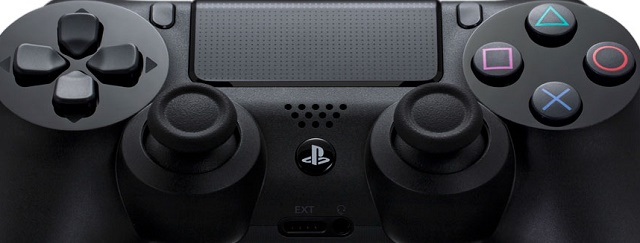
D-Pad: While the DualShock 3 already had a solid d-pad, Sony’s engineers made it even better, making the buttons a bit longer, more angular, and allowing for an even better clicking sensation when depressed. Visually, it still looks nearly the same, but you’ll certainly feel the small difference.
Analog Sticks: I strongly disliked the analog sticks on the DualShock 3. Those domed heads were impossible to grip, the sticks were too close together, and they were far too loose for any decent gameplay. All of those things have changed this time around. While it still has a slight dome to it, it also has a rubberized outer ring, similar to the Xbox One’s, that should make for better control. The sticks are also further apart now, and they have been tightened up.
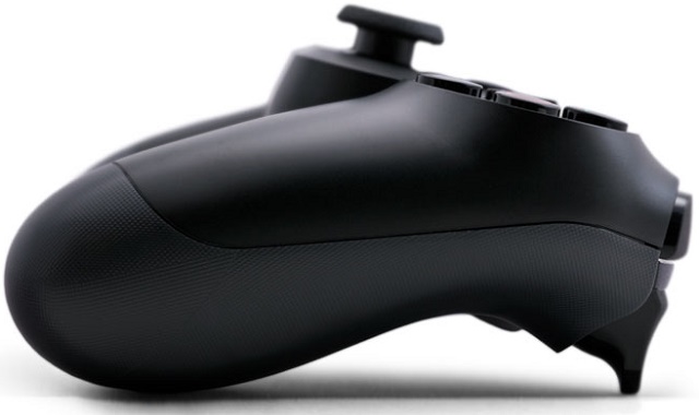
Overall Size, Shape, and Weight: Whereas the DualShock 3 was tailored to the Japanese market, built light and small, the 4 takes a cue from the Xbox 360 controller’s success and puts on some weight. The 4 is now substantially larger and heavier than the 3, which may irritate some who enjoyed the light weight, but I think it allows for a much better feel in the hand.
Additional Features: The touchpad will be the biggest change for gamers, since the light bar is mostly hidden from sight. Right now, the touchpad is pretty limited, but its possibilities should be unlocked further down the road as developers think of creative uses for it. It’s clickable, and it can sense where it is being clicked, so a developer could theoretically add many more buttons: click the left side, center, right side, etc. Plus it allows for quick swiping motions or scrolling like a regular laptop trackpad.
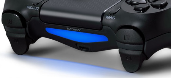
The light bar, on the other hand, is mostly hidden from the players view, situated on the back and angled downwards. The light will glow different colors to differentiate players, and can be used by games to indicate something, like health level. If you’ve got a PlayStation Camera, it will be able to sense where you are using the controller’s light.
The Select and Start buttons have also disappeared here and have been replaced by Options and Share. Options will likely function similarly to the Start or Select button, pulling up in-game menus, but the Share button is reserved by Sony to allow you to share the last few minutes of gameplay through the native software. (The Xbox One achieves this functionality through the bundled Kinect sensor.)
This controller also has a small speaker for game audio, and a standard headphone jack for plugging in your own headset.
Again, Ali-A has done a fantastic comparison of the DualShock 3 and Dualshock 4.
I genuinely love both of these controllers, and I think that they’re leaps and bounds better than their predecessors, but you are going to run into some differences.
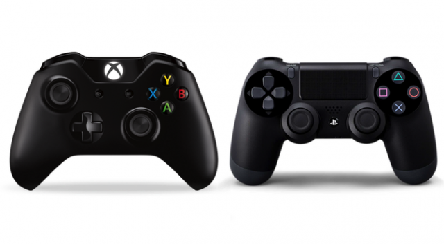
Triggers And Bumpers: Both next-gen controllers have clicky, much-improved triggers and bumpers, but the Xbox One controller has impulse triggers and a more curved design that fits better to your fingers.
Buttons: Both controllers have solid button layouts that are nearly identical, but the touchpad on the DualShock 4 does technically give the PS4 developers more options for buttons.
D-Pad: There are two great d-pads here, and I think this one comes down to personal preference.
Analog Sticks: I prefer the One’s analog sticks, with the curved in the top, but this is my own preference. Both controllers have phenomenal, if slightly different, analog sticks, and the biggest difference is the layout on the controller.
Overall Size, Shape, and Weight: With its larger size and weight, the DualShock 4 is more Xbox-like. With its slimmer design and smoothed out back, the One controller is more PlayStation-like. Whichever feels better in your hand will again come down to — you guessed it! — personal preference.
Additional Features: Some may see the light bar and touchpad as gimmicky, while others may find them very useful. Both can be plugged in via micro USB, but if you don’t want to burn through AA batteries constantly, you’ll want the DualShock 4, which runs off its own inner rechargeable battery. The standard headphone jack on the DualShock 4 could also be a deciding factor for many.
The last video below is another from Ali-A comparing these two next-gen controllers.
In the realm of the console wars, the battle between the PS4 and Xbox One is intense. Sure, there are also many reasons to consider the Wii U, but the Wii U Pro controller sure isn’t one. The Xbox One controller and DualShock 4 are some of the most well-designed pieces of gaming hardware to exist, and both should please any gamer.
What do you think? Which is your favorite controller? Let us know in the comments, and don’t forget to tell us what your favorite console is over at this week’s MakeUseOf Poll.



 Swarm Walkthrough
 WWE 2K14 Wiki: Everything you need to know about the game .
 The Tribeca Film Festival unveils Half of its Lineup
 Top 25 Best Survival Horror Games
 Top 30 3rd Person Shooter Games of All-Time