

Gaming and cutting-edge graphics have always gone hand-in-hand for obvious reasons. Virtual worlds are more immersive when they appear more realistic or, in absence of photo-realism, are stylized with competent artistic direction.
But not all games look good. Even popular titles from studios with hundreds of employees can end up less appealing than a baboon’s rear-end. Here are five fun games that’ve received strong reviews in spite of ugly graphics.
Mojang’s Minecraft is the quintessential example of a great game with terrible graphics. The blocky terrain and nostalgic, low-resolution textures exist not just because of lazy design; instead, they enable the gameplay.
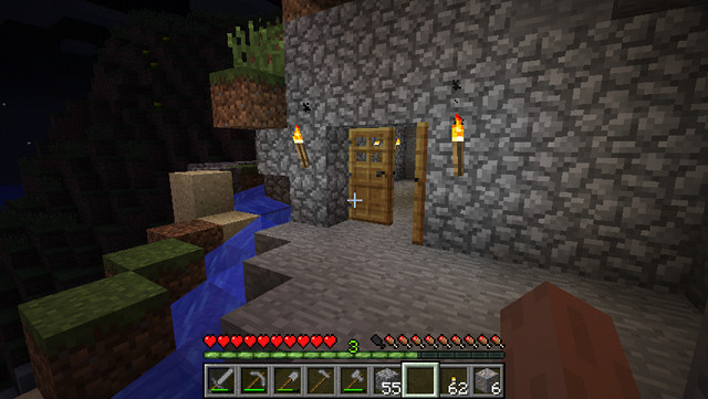
This creates a paradox. Minecraft is unappealing at first glance, yet fans of the game actually find its low-fi vistas a thing of beauty. They suggest limitless possibility, and a keen imagination can eagerly paint between the lines. This makes Minecraft similar to abstract art. Where some people see a mess, others see a breath-taking landscape.
The success of Minecraft inspired a surge of games with 8-bit or 16-bit style graphics, but few have matched up to the original. This, arguably, is because they go too far, adding more textures, more enemies, and more environments in an effort create a more detailed world. But detail was never the point.
Bethesda’s games have always featured an unusual blend of beauty and unpleasantness. While stunningly detailed and full of high-polygon, high-resolution models, quirks like strange animations and odd character design have always caused the studio’s games to look not-quite-right.
With Fallout 3, however, Bethesda reached a new level of repulsive. The game’s post-apocalyptic setting gave graphics designers a chance to go hog-wild with shades of brown and gray. Endless stretches of scarred land go out in all directions and, as you explore, you’ll meet a crew of horrifying creatures and pick up broke-down weaponry, most of which looks held together with a few pieces of twine.
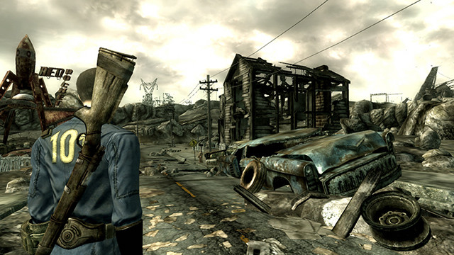
All of this fits the setting, of course, and Fallout 3 is an entertaining open-world game. But it does get a bit depressing, and the handful of quests that send you to more appealing areas are too short. The game’s sequel, Fallout: New Vegas, did a much better job of blending the drab wastes with colorful locales; that it was developed by Obsidian Entertainment, not Bethesda, is no coincidence.
Space games are usually among the most beautiful ever designed. There are relatively few models on screen and no need for high-polygon terrain. Throw in some awesome particle effects and you’ve got the recipe for screenshot satisfaction.
Kerbal Space Program has none of this. Instead this indie title makes do with basic textures and models with polygon counts that could charitably be called “modest.” Throw in almost featureless planetary terrain and you’ve got the recipe for one heck of an ugly game.
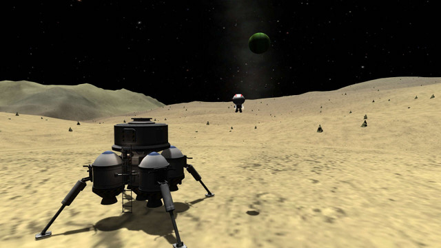
Whether Kerbal needs to be ugly is debatable. Relying on basic graphics no doubt gives the small development team more time to focus on other features, but those features have been released slowly and even now, almost three years after its first release to the public, Kerbal remains in alpha.
But that doesn’t matter to fans. For them, the game’s open-ended approach to rocketry is absolutely unique and the basic graphics are, if anything, desirable – if some gamers need more, well, that’s what mods are for!
Path of Exile is an excellent action-RPG and, for hardcore fans of the genre that miss unforgiving character builds and difficult bosses, it’s absolutely the game to play. You can enjoy it for free and, unlike many of its F2P peers, Path of Exile doesn’t use annoying pay-gates or disable features for free players. There’s just one problem; the game is butt-ugly.
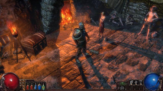
Like Fallout 3, this game is ugly by design. The unforgiving design and grim graphics are meant to entice Diablo fans who dislike Blizzard’s latest release. Both monsters and men look like they’ve been thrown in a tumble-drier with a pound of gravel. Path of Exile makes money off graphical upgrades for armor and spell effects, so the basic stuff can’t look too good.
The dull spills over to the landscapes, most of which are rendered in dreary brown and gray. Even the forests rely on dark, almost-black shades of green; the only bright spots are a few jungles and temples. But hey, it’s free and its fun – stunning graphics might be too much to ask.
There are a lot of ugly console games on the market right now. The Xbox 360 and PlayStation 3 are in their golden years, and while some developers (like Rockstar) have the resources to extract impressive visuals from ancient hardware, others have to make do with less cash and a smaller staff. And so we come to Dark Souls.
Both of the games in the franchise brew the perfect recipe for ugly visuals. They’re developed by a mid-sized studio attempting semi-realistic graphics with a dark color palate and limited resources. To make matters worse, both PC ports have received only the most basic upgrades. The result is an atrocious mix of dull textures and bland scenery.
The game is so ugly that some players have accused the developer, From Software, of fooling consumers with pre-release videos and screenshots that aren’t representative of the release version’s gameplay. Comparison videos on YouTube show a huge gap between what was shown at trade shows and what’s actually experienced with the console version of Dark Souls 2.
None of this impacts the mechanics, which revel in unforgiving and nail-biting fights, but it does make the world of Dark Souls far less interesting than it could be. Though it’s an open world game, tight levels and drab backdrops sap the landscape of vibrancy. Just imagine what this title might be like if it were designed for the PC or next-gen consoles!
As these titles show, graphics don’t make a game great. That’s what gameplay is for. While attractive visuals help with first impressions, they don’t retain players, and only the very best can temporarily enthrall.
What’s your favorite ugly game? Did its visuals turn you off at first, or did you barely notice? Let us know in the comments!



 Ultimate Tips and Tricks To Survive Realistic Mode In Call of Duty: Black Ops III
 Three Things Master Chief and Cortana Could Teach You About Marriage
 9 Video Game Themed Comics Books You Should Read
 How to Fix Far Cry 4 Graphics Issues, DirectX Errors, Sound Issues, DLL error, Black Screen / Shadow Issue and more
 MGS 5 - The Phantom Pain: mother base guide