Who is responsible for the '90s? Seriously, I want to know so I can corner them in a room and give them a stern talking-to. There is an undeniable amount of nostalgia contained within those years, but also quite a lot of shame - bright neon clothing, fonts that make graphic designers cringe, and the inherent need to cram visual over-stimulation into our ad campaigns. This setup made for interesting magazine covers as gaming publications strived to be the most notable piece of print on the newsstand.
The list you are about to see doesn't reflect how we at GameRanx feel about any specific publication or video game. We were all victims of the times and as a collective community we did make it out alive. Now is the time to glance over our shoulder as we speed away from that era and remember what used to pass as acceptable.
Click on each magazine cover for a higher resolution version, but remember that long-term exposure to anything from the '90s will cause blindness.
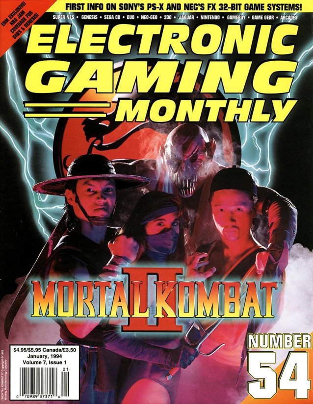
Electronic Gaming Monthly - January 1994
If I had seen this ad for Mortal Kombat II, I would not have purchased the game. These characters look like they've fashioned Halloween costumes out of things they found lying around the house. Except for Baraka (thanks, Jerry!), looming over everyone in the background. That mask is so terrible, I can actually see the person's eye peeking out in horror, hoping no one can perform a retinal scan and determine who he actually is.
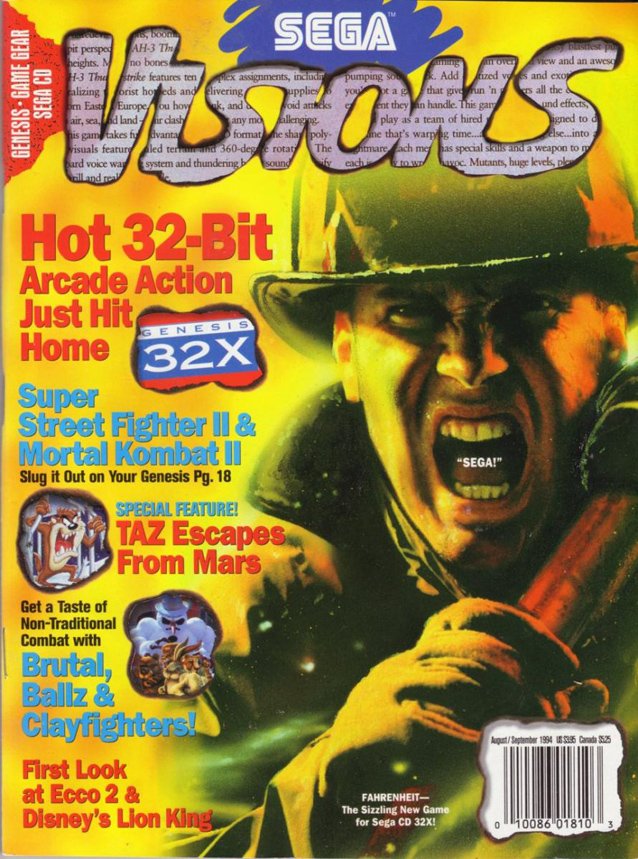
Sega Visions - August/September 1994
Oh Sega, you remind me of a simpler time, when touting "Hot 32-Bit Arcade Action" was actually a good thing. I understand the concept of this Sega Visions issue, but the "SEGA!" placed over the fireman's mouth just kills me every time.
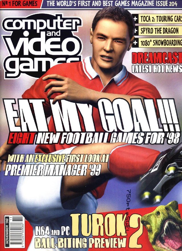
Computer and Video Games - November 1998
This football/soccer player is decently modeled, but that doesn't excuse the look on his face that says he may have just seen two naked elderly men making out in the stands. His totally disgusted face is so distracting that it's easy to miss the dinosaur awkwardly popping up out of the corner.
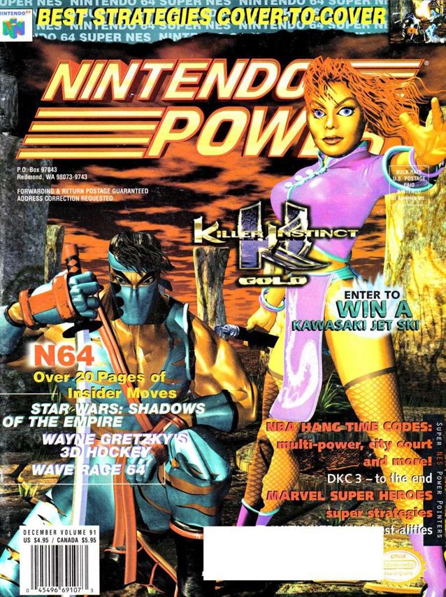
Nintendo Power - December 1996
Sometimes I take current graphics for granted. A singular glance at this cover and I'm so sorry I ever forgot how far we've come. One character has noodles for hair and another has the most awkward muscle modeling I've ever seen. This is best left in the '90s.
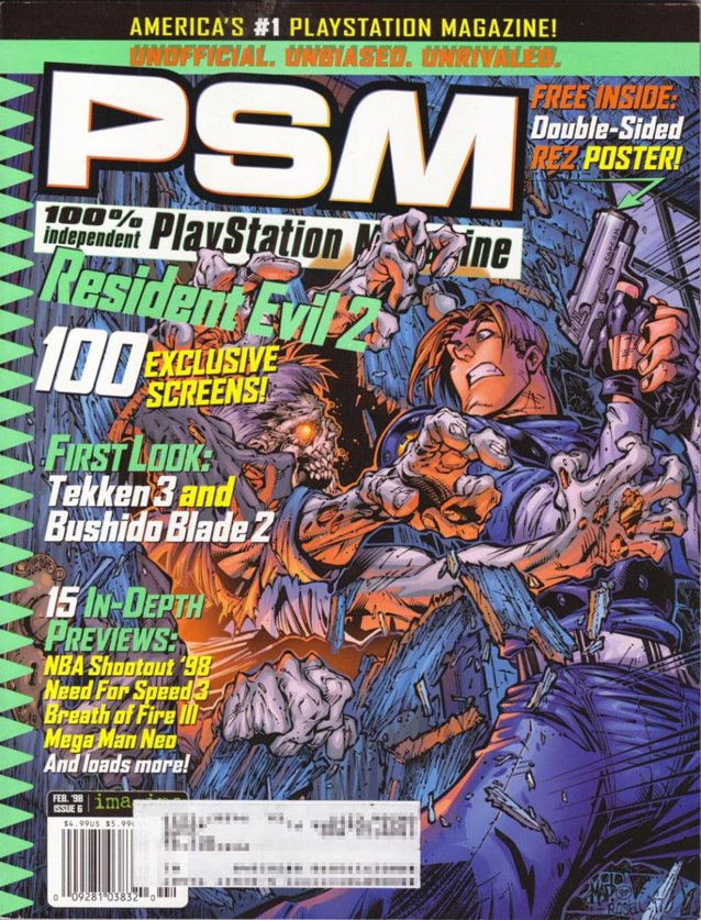
PlayStation Magazine - February 1998
Now, this is actually one of the cooler covers I've seen. The past trend of using concept art as cover material is a fascinating and awesome way to promote a title that might not look that great in-game. But this shot is way too close to Leon's crotch. Nothing has been left up to the imagination. Ew.
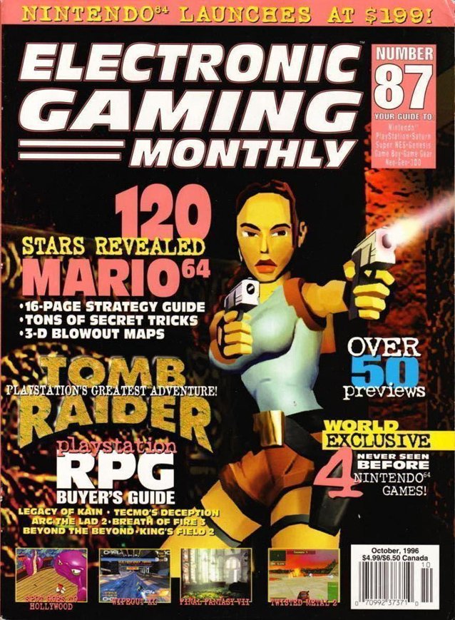
Electronic Gaming Monthly - October 1996
Lara, your face. Woof. In addition to Lara looking totally not camera-ready, what really scares me about this cover is the 10+ fonts utilized. Lately, minimalism is really "in," and the '90s completely contradicted that style.
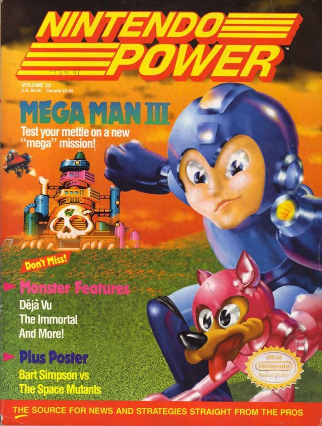
Nintendo Power - January 1991
Oh, I take it back. I take it all back. I want to turn around and apologize to Lara, but it's too late. Why does all early Mega Man art look like his face is melting off? With a cover like this, I'm amazed anyone bought Mega Man III. Rush looks like he's a vet visit away from being euthanized and Mega Man's glassed over look makes me wonder what psychotropic drugs he is on.
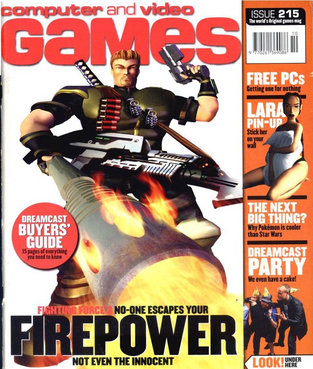
Computer and Video Games - 1999
I miss the days when we thought we could throw a Dreamcast party and more than two people would show up. There are a lot of things going wrong with this cover. The awkward perspective of Hawk Manson, star of Fighting Force 2, with his stick of fire, the creepy Lara Croft pin-up ad, and the claim that Pokemon is cooler than Star Wars all adds up to a failure. A giant failure.
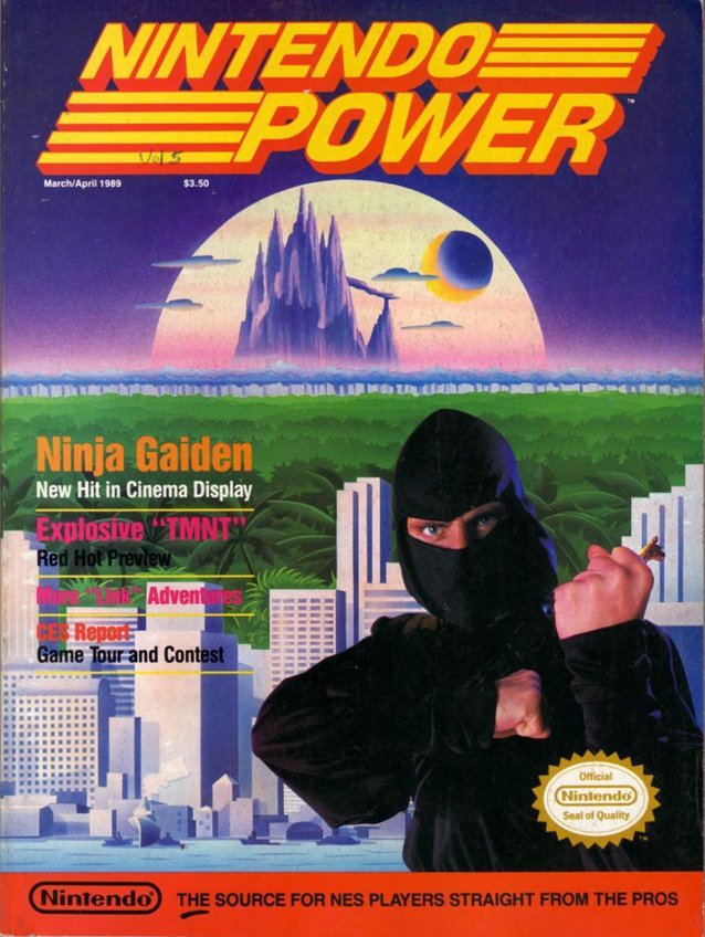
Nintendo Power - March/April 1989
Now, I know this issue is straight out of the tail end of the '80s, but it showcases one of the largest problems I have with '90s - the knee-jerk reaction to combine concept art with live actors. Who is this dork? He looks like he made his cowl out of a black t-shirt and then dressed himself in garbage bags.
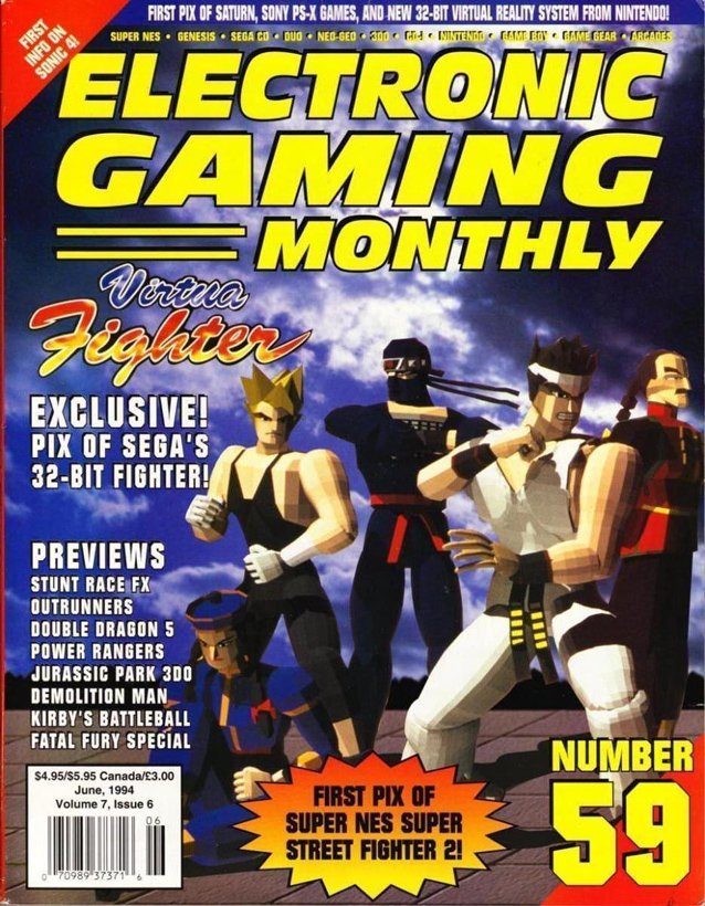
Electronic Gaming Monthly - June 1994
Is this better or worse than a rag-tag group of uninformed actors attempting to personify the Virtua Fighter characters? I don't know, but this is pretty bad. If I can count the number of polys that comprise a character on one hand, you might not want to lean on graphics as a major selling point of your title.
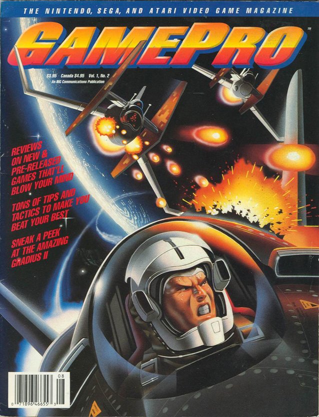
GamePro - July/August 1989
Here's some more awesome concept art for a topdown that will never need this much detail. Don't you just wish your futuristic spaceship had a rearview mirror so you could see who was shooting at you? With that helmet design, he's like a horse wearing blinders.
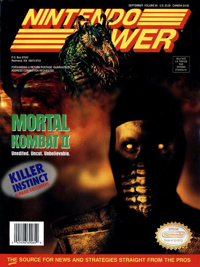
Nintendo Power - September 1994
I never thought I would say this, but Nintendo, you are scaring me. Having seen another version of a Mortal Kombat II magazine cover, I can honestly say that although Nintendo Power wins, they also will be haunting my dreams. This is pure nightmare fuel.
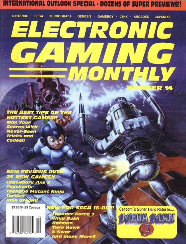
Electronic Gaming Monthly - September 1990
If we can learn anything from this list, it's that Mega Man III had the absolute worst concept art. He's getting an eyeful of Robot Master crotch and apparently likes what he sees.
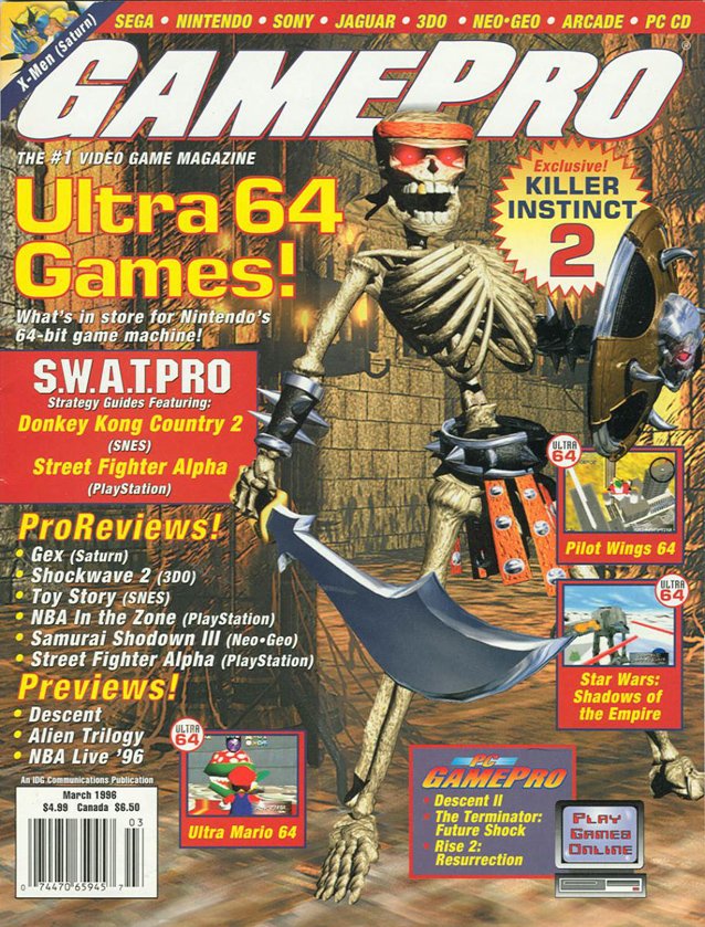
GamePro - March 1996
I don't know how this skeleton is standing up. His posture would indicate that he'd just tilt backwards. One way to not sell your game is to show off the poor floor texturing with extreme closeups. Also, the spine is not one long bone.
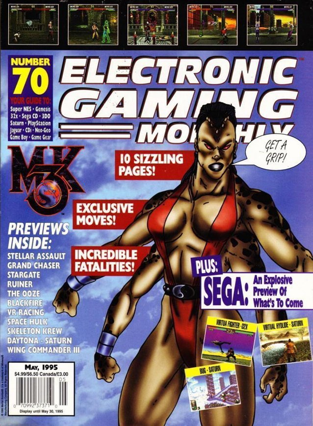
Electronic Gaming Monthly - May 1995
This airbrushed version of Sheeva is horrifying. Her mullet and heaving muscle-boobs burn an image into my brain that I cannot soon forget. The suggestion that I should "Get a grip!" makes no logical sense to me. Maybe if she was choking out Liu Kang it'd be funny, but as it is, she just looks like an angry four-armed lumberjack who neglected to put on real clothes.
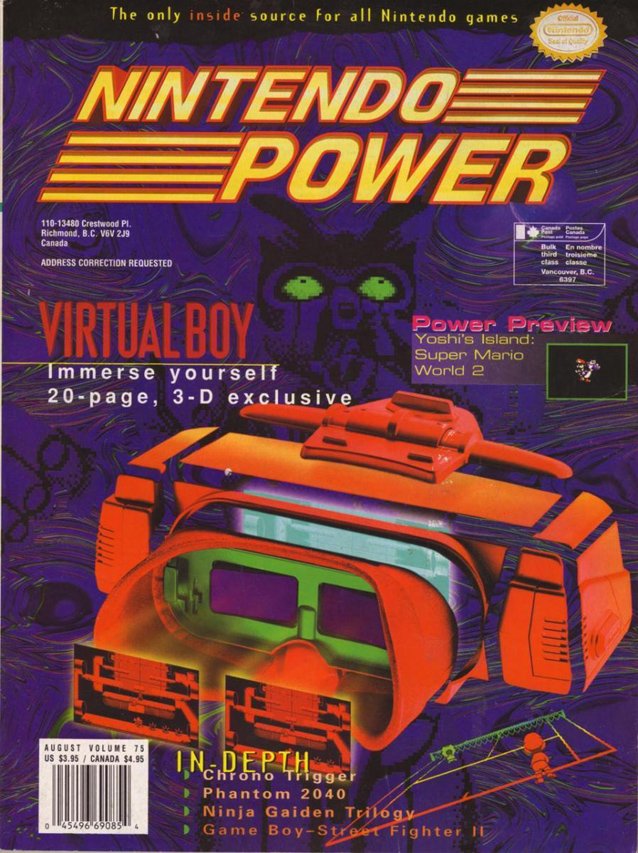
Nintendo Power - August 1995
The background image is actually what you end up seeing if you play with a Virtual Boy for more than an hour at a time. When you purchase Nintendo's sight reduction device, it comes with a manual warning you about the green eyed demon that will inevitably consume your every waking thought. The Virtual Boy epitomizes the '90s. It was completely pointless, induced headaches, and held our attention for a total of fifteen minutes.
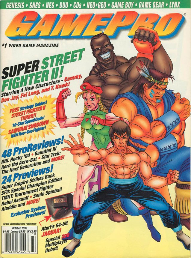
GamePro - October 1993
I tend to believe that Street Fighter has some of the best concept art I've ever seen, but this blows everything I believe out of the water. This cover looks like a fan drawing by a ten-year-old. The perspectives are just so flat out incorrect on the characters and they have zero depth. Thankfully, this horrid piece of "art" doesn't affect Super Street Fighter II or its success.
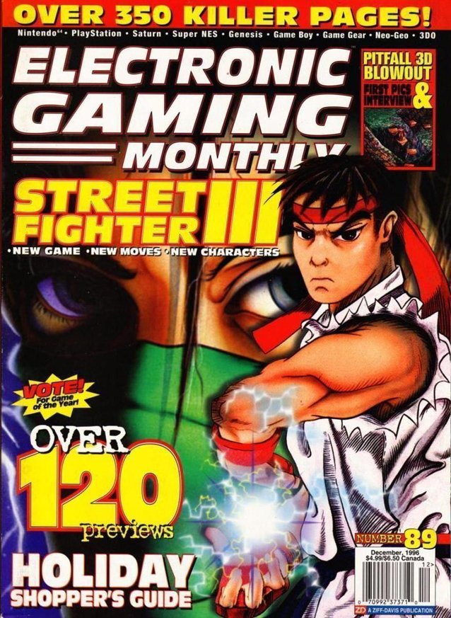
Electronic Gaming Monthly - December 1996
Three years later and Street Fighter is still dealing with the same problems. This time Ryu's arm is apparently popping through the page and is bent at some crazy angle, threatening the reader with a "HADOUKEN!" He is also apparently very tiny.
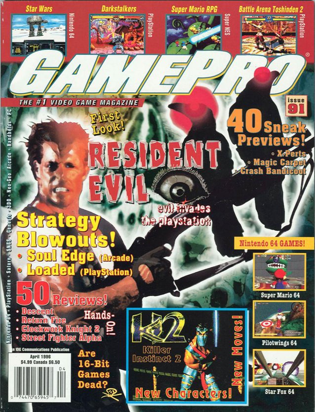
GamePro - April 1996
Oh my goodness. I don't even really know what's happening here. We've got a Resident Evil scene with a terrifying eye, laser-crows, and a Bruce Willis impersonator. It should also be noted that "First Look!" is bragged on the cover, save the crows, none of this reminds me of Resident Evil.
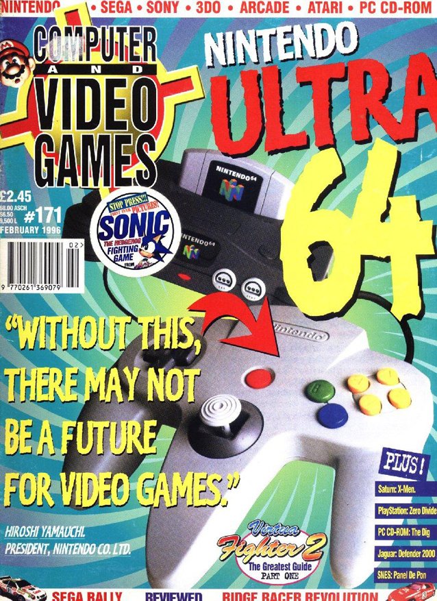
Computer and Video Games - February 1996
The font is so offensive on this cover it makes my brain hurt. When you first look at this cover, it's impossible to really focus on anything. You've got "64" yelling in your face and an inane quote from Hiroshi Yamauchi taking up 25% of the page. The half of the cover taken up by a total of fifteen words could have been used to, oh I don't know, actually explain what's in the issue.
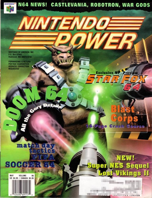
Nintendo Power - May 1997
You might not initially get that this cover takes a first person perspective as though you are playing Doom 64. The awkward warthog-demon also apparently has the worst aim ever as he blasts a shot off to your right. The idea is great, but the execution was very sloppy and just looks a little too much like a '90s xmas with the neon green and bright pink contrasting.
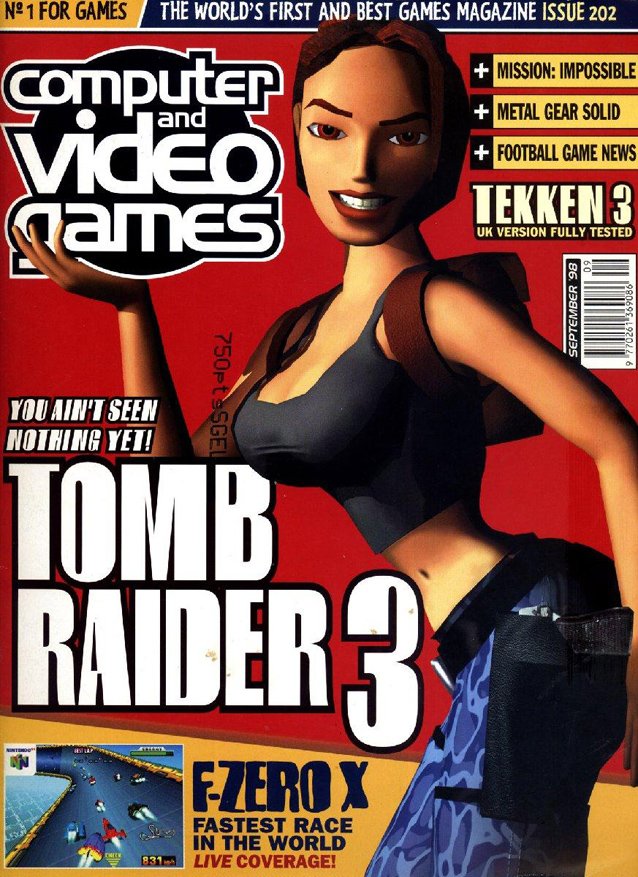
Computer and Video Games - September 1998
Poor Lara. She's had a lot of stuff happen to her in this list. She's had her worst photo ever used, photoshopped onto the body of a naked woman, and now she is striking an uncomfortable pose to show off her T&A. I get that she is the first female video game character boys were attracted to, but this is just cruel and unusual punishment. Pasting a smile on her face just makes the whole thing feel so dirty. Also, wearing blue camo pants should be illegal.
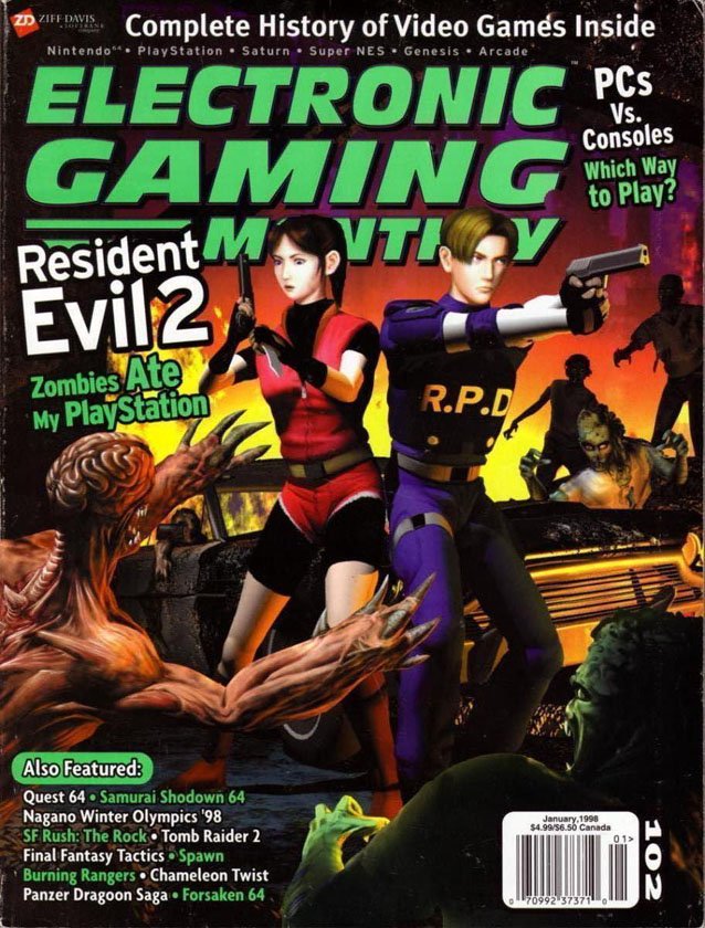
Electronic Gaming Monthly - January 1998
Leon and Claire fight back to back, but it seems like Chris' little sister has officially forgotten what to do with a gun. I'm never a fan of concept art that surrounds our protagonists with enemies, but forget to give them the brains to aim anywhere near their target. Claire is just standing there, awaiting the hug from the rapidly approaching Licker.
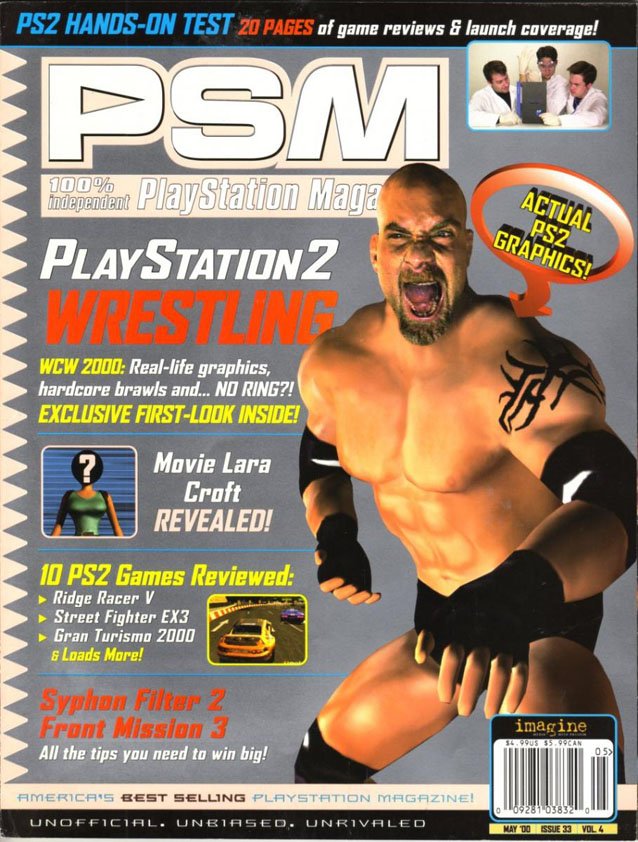
PlayStation Magazine - May 2000
Here we have an issue that was released after the '90s, but still suffers from the sad trend of showing off sub-par graphics in an exciting fashion. I get that WCW 2000 was fun, and I appreciate the tame nature of the text, but Goldberg is not looking too good. He looks like he might be in the middle of sneezing and his muscles range from being flat to lumpy. Bill might want to go see a doctor about those things - they could be tumors.
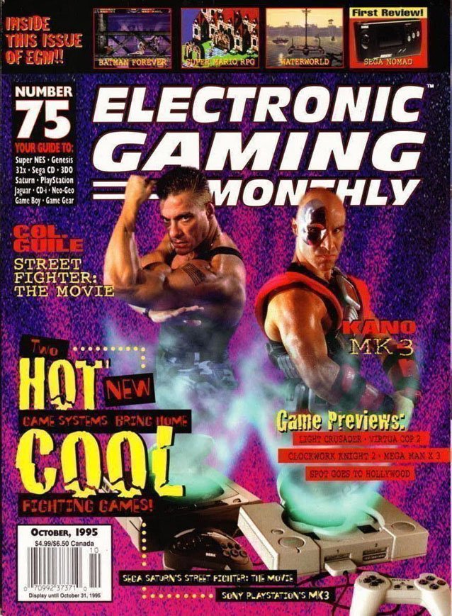
Electronic Gaming Monthly - October 1995
The severed torsos of Guile and Kano hover above the Sega Saturn and PlayStation, but all I can think is "So, they got Jean-Claude Van Damme to reprise his role?" Shrugging off the ridiculous notion that I ever dreamt of men popping out of my consoles like so many genies out of lamps, the font setup on the left is just amazing. Nothing is cooler than broken letters - it's so hip and incomprehensible to adults.