
By Ben Salter

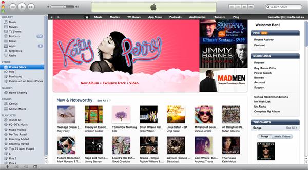
iTunes 10 arrived earlier this week with quite a few changes to the popular interface. If you’re not a fan of change, rest assured that usability and the general layout can be reverted back to something similar to the iTunes 9 style with a little bit of tinkering.
The new interface has been made simpler, but the side-effect is a very dull looking piece of software. Everything is primarily grey mixed in with a little, wait for it, blue-grey and white. The whole thing looks very plain and the only things that really stand out are the close and minimize buttons, which are now presented vertically.
The basic functionality in iTunes 10 remains the same. Your media libraries, the iTunes store, Genuis and playlists are all presented in a navigational bar to the left of screen: nothing’s changed here besides the omission of colour. Your music can be listed in one of four options: Cover Flow, cover thumbs, a grid with album covers (which looks terrible) and a straight forward grid listing your songs and all of their relevant information. The latter is by far my favourite, as I’ve never been a fan of Cover Flow. Listing music with a combination of the grid and covers looks terrible as it only works sorting by artist or album and then there’s a gap of 10-20 songs without covers as they’re all on the same album, leaving the cover column empty and wasting space. The simplest option, of plainly listing your music, is the best unless you’re a diehard cover art fanboy and love to browse one CD case at a time with Cover Flow.

Moving with the times, Apple has changed the iTunes logo from a music note over a CD to a music note in a blue circle. Considering most iTunes users would purchase music digitally nowadays it makes sense, but changing one of the most recongised software icons isn’t without risk. Everyone knows the iTunes logo and it’s going to take time for consumers to adapt and relate to the new icon as being iTunes. Seeing how they bothered to change it, it’s a little odd that they’ve stuck with just the music note considering iTunes now manages music, TV, movies, eBooks, Podcasts and apps; however, the iTunes brand is too strong to rename now, even though it’s so much more than just a music player.
The biggest addition to iTunes 10 is Ping, Apple’s entry into the world of social networking. Ping is specifically for the music community; it allows you to connect with people of a similar taste in music and follow artists that like to share what they’re doing with the world. Although, expect it to be a little more professional than Justin Bieber saying “I walk into diz door 2day. haha LOL” as is the trend on Twitter. At the moment it’s very basic and only seems to cater for fans of recent pop music. Expect that to expand, but it’d be nice if it could somehow introduce you to new artists, kind of like Genuis, based on who you’re following and who you’re friends with.

Podcasts are an increasingly important part of iTunes; however, there doesn’t seem to be a way to follow podcasters through Ping, only popular artists. Sure, most podcasters are just Web 2.0 contributors, but there are some professionals out there, and even the amateurs would gather a decent fanbase through Ping.
Overall, iTunes 10 brings mostly cosmetic changes, which are too bland for mine. Cover Flow and some of the other layout options inject some colour, but they’re not as usable as the standard grid. Ping is an interesting concept, but currently it has a long way to go and doesn’t appeal to a broad range of music fans. It’ll be interesting to see how it develops over the coming months.


 Watch Dogs: find all 13 ctOS Tower locations
 Smite God Guide - Arachne in Arena
 Pokemon X & Y Guide: Laverre City Gym Guide
 Elder Scrolls V: Skyrim Prophet Quest Guide - GamersHeroes
 PayDay 2 Guide: Complete Mask & Materials Guide (Full Images)