

New season; new game. SMITE has gotten a major face lift for Season Two. Everything is streamlined, from the splash page and menu bars to the character selection and customization pages; and the new Conquest map is stunning. Here is a synopsis of the first Season Two patch.
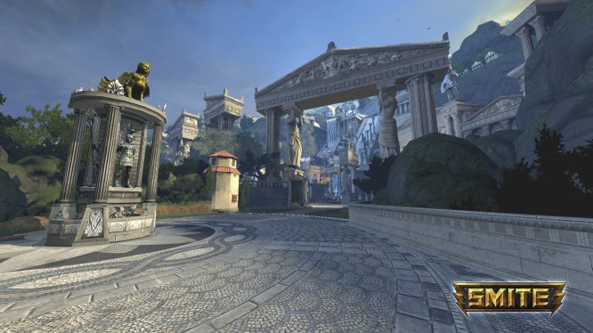
In the past, my biggest complaint with SMITE has been its splash page and menu system; it felt disjointed, like a place holder for something else–something better. Nothing felt intuitive; instead, the pages looked like a series of disconnected projects thrown together. It took a bit of looking to find basic descriptions and lore pages. Player stats, icons, and load out features were herded into the left corner of the browser, and features like icons, ward skins, and loading frames seemed like last minute additions. The brown(ish) background color was unpleasing to the eye, and the waving cyclopes felt out-of-place. Buttons were very small.
Hi-Rez has fixed everything. The new splash is vibrant blue, a night sky with ghosted constellations. The player HUD has been moved to the front and center, and player icons, wards skins, announcer packs, loading frames, pedestals, and boosters can all be purchased and changed by clicking the player icon.
The menu across the top has been rearranged slightly. Clicking “Profile” brings players to a complete and comprehensive in-game record. Players no longer have to click through the side bar to peruse stats via tabs and side bars. Instead, by clicking the top left button, players can view in-game statistics, worshiper statuses, and match histories instantly.
I love this feature. I have always praised SMITE for keeping detailed audits of in-game statistics. Games like League of Legends rely on third-party sites like lolnexus.com and op.gg to house detailed player analyses; some of these sites update weekly, if ever. Lolnexus.com, for example, claims I only have two ranked League wins. I know better. SMITE has always done a great job catering to hardcore gamers and statistic junkies. Now I can access my stats in less than three clicks. Good move, Hi-Rez.
Gods, as always, can be found by clicking top bar–but the gods menu has changed substantially since Season One. Clicking a god pulls up a series of tabs that can be used to either inform the player or customize the character. Skins, abilities, stats, lore, emotes, history, and the god building tool can be found in a matter of seconds. Again, everything has been centralized and can be accessed in less than three clicks.
Everything except non-promotional god skins can be purchased by clicking on the store; no more page sifting. Quick redemptions and transactions can be processed in a matter of seconds.
Clans and friend referrals now have a special “Social” tab, and ranked players now have an updated “Competitive” tab. Both are welcome additions to the Season Two menu. Friends can still be added and checked in the bottom right-hand corner; the party and friend menus have changed little, if at all.
Above all, I am most impressed by the “Wisdom” tab. Twitch and YouTube have been integral to SMITE since day one. The Season One splash page did a great job making viewership quick and easy. Players clicked the media tab and instantly joined a featured Twitch room. Now, players can watch live feeds, expired games, video tutorials, god guides, and community videos in one place, effortlessly. Players are also encouraged to broadcast their matches to Twitch and are given the tools to do it within the game client. It is, by far, the most advanced multimedia collaboration any MOBA game has tried to accomplish, and SMITE combines each platform seamlessly.
Graphics appear to have received a slight overhaul. They look more detailed. I am not sure if the characters themselves have received any more polygons, but the textures and shadows look much better—even on my bare-bones laptop.
Games also seem to have much less lag, allowing gamers on more primitive computers to play at slightly higher levels. As far as I know, the system requirements have not changed—which means Hi-Rez has done a lot of under-the-hood work to ensure every game looks good and plays well, regardless of the system. To test, I played a match last night on my laptop. It ran at almost sixty frames per second. Even basic games like League of Legends have a hard time running twenty frames per second on my HP. The amount of care the developers put into this update is truly mind blowing. The downside: I no longer have anything else to blame for my terrible in-game performance; I just suck.
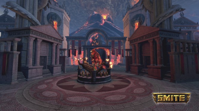
Arena, Assault, and Siege still look and feel basically the same, but the Conquest has been changed drastically. The map itself has been divided visibly into two sections: Order (the blue side that houses Mount Olympus) and Chaos (the red side that contains a volcano). In an interview for the official SMITE YouTube page, creative director Scott Zier was candid about the look and feel of the new map. He said, “There were two goals… one was that we wanted to increase the art quality throughout the map for individual fidelity. The second goal was we wanted to improve player navigation.” The team has succeeded on both of these goals, I think.
The map itself looks great. Mount Olympus adds a sense of place to the map–something Season One Conquest severely lacked. Assault took place in Asgard. Siege was fought in Aztec Ruins. Conquest merely existed. Titans rested at the ends of lanes with little reason. Now, players feel invested in their conquests. The game has stakes; there is something to be gained and lost. Players must protect Mount Olympus or overthrow it.
The map also contains landmarks to help players better grasp their bearings. Lava plumes and the Aegean sea help players differentiate between single and duo lanes. Players can now navigate Gold Furies, Fire Giants, and jungle buffs with ease.
Furthermore, the jungle has received a major facelift. There are now fewer mana camps on the map. One of the biggest problems in Season One was the amount of mana available to players. No one ever seemed to run out. By cutting the number of mana boosts on the map, players must play smarter with fewer potential moves. Laning gods will have a much harder time this season clearing minions at lower levels. The mana buff is also located on the Gold Fury side now, which means the jungling meta has changed significantly. The speed buff has split in half. Now, instead of one over-arching speed buff, players must now contest over movement speed buffs (still orange) and attack speed buffs (purple). As a result, hunters and assassins will no longer have to fight in the middle to claim the same buff. Orange buffs now lie exclusively on the Fire Giant side of the map; purple buffs lie on the Gold Fury side. As a result, the jungle flows better. The correct jungle path is much more intuitive.
And it looks great. All jungle creeps have new animations; they don’t simply appear and disappear anymore. Notably, the Fire Giant now breaks free from his stone prison every time he spawns and the Gold Fury circles its base before landing and spawning. Cyclopes that hold buffs have been remodeled to better reflect their camps, and the Phoenixes, Titans, and the Gold Fury have received major graphic overhauls. As a result, creatures feel less like things to kill and more like active, living set pieces. Conquest is much more immersive.
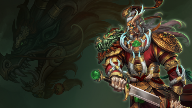
Season One was notoriously unbalanced. Many overpowered gods like Ao Kuang and Apollo (who were so notorious in professional play, they were often banned) have received significant nerfs, balancing them and making games much more entertaining. Under-powered champions like Cupid and Chronos have received substantial boosts.
The development team has also addressed several ability issues and bugs; players will no longer be able to use popular glitches to their advantage.
Several items have also received overhauls, too many to list. But if you want a complete list of changes, check out the forum post here.


 WoW Wednesday: The Path of Least Resistance .
 5 Memorable Moments in MMO History .
 Hands-On Warhammer 40,000: Eternal Crusade .
 Grepolis: Become a Hero and Conquer the World
 Eorzean Evening Post: Should You Roll an Alt? .