
The Machine Itself
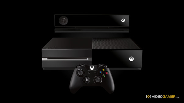
Despite promises of the sort of living-room omnipotence that would make Orwell blush, the Xbox One isn't just going to walk into your house and plunk itself under your television. Someone will have to put it there (probably you), and so it stands to reason your first interaction with it may very well be touching the unit itself.
It's fairly weighty - although it still has a, curiously good-looking, power brick - and although your mileage may vary it's more impressive in the flesh than it has appeared in photos (it doesn't look that massive). It looks - and feels - sturdy, as does Kinect, which in terms of design complements it well, while at the same time looking like a device that spied on its masters in an issue of 2000AD we once read. Also get ready to polish the top of it, as like the PS3 it picks up fingerprints and blemishes like Roy Keane picked up red cards.
Also, we're not huge fans of the white (why not green?) LED that displays the Xbox logo (which is also a touch-activated power button): it reminds of that bit in the original Star Wars when they forgot to colour in the lightsabers. Finally, the eject button, if you've got no disc in the drive, makes the dullest, Windows-style 'donk' noise.
The Controller
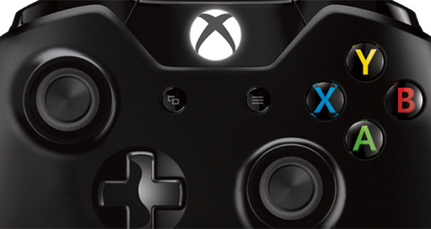
The Xbox One's pad is both improved and, in some glaring ways, curiously unimproved when compared to the Xbox 360 equivalent. The d-pad is better, as you would hope, and the triggers are still excellent (the rumble feature is also a nice addition, albeit quite loud). The battery compartment has also been changed: batteries now lie horizontally, flush against the actual pad rather than needing a separate holding compartment. And we all know how fragile those things were.
So, a lot to admire. And yet those bumpers are still poor: they feel overly plasticky, clicking feebly. Worse, they still suffer from the problem the old bumpers had, which is that you weren't sure how much you were really depressing them. For players who like to rest their index fingers on them, there could be some accidental presses during heated moments of play.
Appearance-wise, they're not up to much either. A large part of the body is matte black, with a glossy strip running across the top (and encompassing the aforementioned buttons and triggers). It gives, to us, the pad a rather third-party look: meant to be sleek but just looking cheap, especially the very visible seam on the rear of the pad that runs from the triggers down.
That said, we've been playing for hours with the pad, and it has been comfortable and responsive in every other way. That stick placement is still the best in the business, and it's as comfortable in the hand as it has always been. Which, we've got to say, is the most important thing.
The First Start
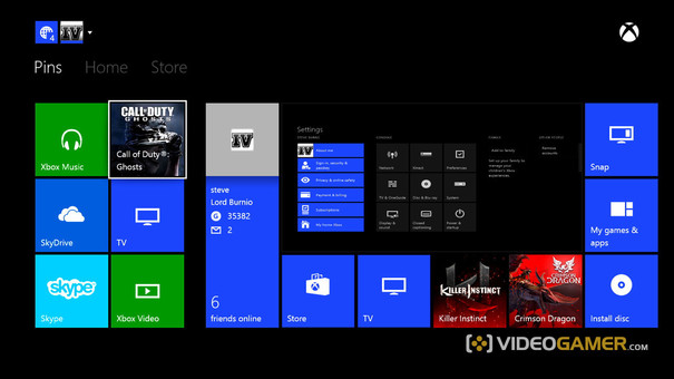
Booting your console for the first time sees you checking out a hyper-green Xbox One splash screen for about six or seven years while the machine configures. From then, it's a whistle stop tour of all the usual questions: who are you, where are you, sign in, test Kinect. You'll be asked about security settings, energy saving, and colour schemes for your icons - don't choose anything but default green. Some icons (such as Xbox Video) won't change anyway, and the clash is hideous.
The Dashboard and UI
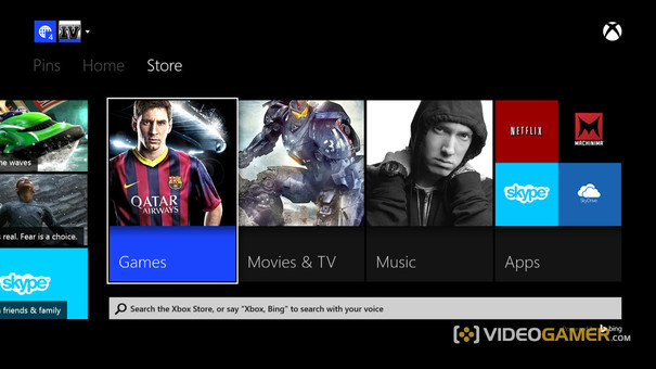
One reset later and you're on the home screen. If you took our advice you'll have an OK-looking set of tiles set upon a black background, which isn't very appealing but will probably change. The dashboard UI is broken down into three sections, running from left right: Pins, Home, and Store. (Notifications and sign-in status/options occupy the upper left of the screen, and are much smaller.) They do pretty much what you'd expect: a jab of Start when over most UI elements will give you the chance to pin it for quick access. Home has a large window which will show the last viewed element in it (so, if you were playing Dead Rising and hit the Home button, that would be there).
It also has your last interactions shown as four tiles under the main window, a 'Games and Apps' tile (which houses, yes, your games and apps).
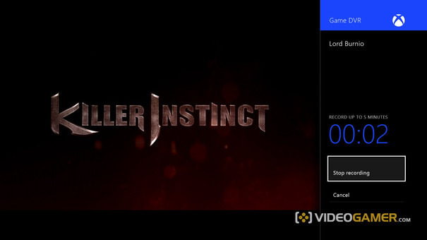
Also featured is Snap. Clicking this will bring up a selection of your downloaded (or pre-installed) apps, which can be selected ('snapped') to run alongside or complement your main element taking up about a third of screen real estate. So, if you want to record yourself playing Killer Instinct, you can do so (up to five minutes). It's a cool feature, if a little fiddly: to stop recording, for instance, we had to hit the Home button, go into the Snap part of the screen and stop it before going back.
The third section is the Store and Bing elements. Games, Music, and TV/Movies are differentiated into separate windows, as are apps. These are exactly as you'd think: portals to that all-important content.
The three main parts of your Xbox dashboard are functional, very responsive, and not a little dull. Which is better than what can be said for certain sub-menus, which house a very cluttered looking amount of options presented in black and grey. It's very 'PS3' - attempting to be all business, coming across as just being stuffy. There's also certain problems where processes can get muddled when attempting to move back through its menus, with B being duplicated with Home, meaning you'll very occasionally have to go all the way out and back into the store of your choice from the front end. (In fairness, this only happened while we were messing around with pinning store elements for games we already had installed, so it might not be too much of a worry.)
Kinect 2.0
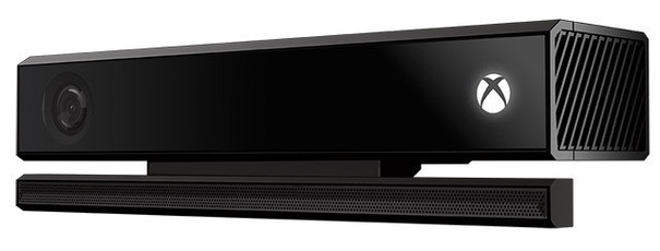
If there's one glaring disappointment in the package so far, it's Kinect. Despite having multiple tests, tutorials, and games for you to play to set it up and get used to its commands, it simply wouldn't work consistently for us: often it wouldn't hear, or mis-hear, our commands, no matter which way we said them. And when you can actually get it to work, it's quite laborious to use.
One example is that you can say 'Xbox Bing' for it to bring up the world's best other search site. (While you're at it, a little bit of text will rather cheekily prod you to 'say...Pearl Jam' or 'search…Superman.') On our connection, it's quick to respond to what you've asked for, and populates the results with interesting and varied answers. But if you want to then ask for something else, you can't just say 'Superman'. You have to say 'Bing', which will kick you out to the search page again.
It's little things like these that show Microsoft, for all the talk, still isn't quite there yet. When it works, the voice-sensing stuff can be pretty impressive, and rather eerily it is very good at recognising you and your face, if you link it to your account.Worryingly, though, if you leave it for a while so the screen saves, walking past the room will make it flash back to full brightness like an excited puppy. At this moment though, it's a wobbly, if promising, start.
Ready To Play/Installing and Uninstalling Data
One of the most impressive elements of the machine so far has been playing a game while it downloads. Not exclusive to Microsoft's console of course, but implemented well: how much you need to have downloaded varies (of course) by game. But it's very cool to be able to jump right in. Weirdly, Ryse let us 'play' after only downloading 5%, but then immediately made us wait while it, er, installed.
More worrying is the fact that it's not obvious where your save game data is stored, and by that we mean we couldn't find it at all. 'The cloud' has been mooted, but we couldn't get to them in any case. As for deleting games, apps, etc, that function is no longer under System and then a couple of sub-menus. Instead, you press Menu to open up a...menu, and you can tinker and delete from there.
Achievements, Challenges, Apps and TV
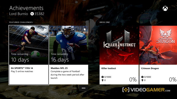
Achievements are back, and they're joined by Challenges, which players have a certain amount of time to complete. Which could be cool. What isn't very impressive at the moment is how long it takes for your achievements to show after they've popped and Home has been frantically jabbed: rather than showing up overlayed on the screen, you're taken to a dedicated achievement section which has to load. Even then, once it told us that our cheevos couldn't be shown, although it did assure us they were still there. Thanks?
As for apps, the standout so far, apart from Snap, is Skype, which uses Kinect very well indeed. The most interesting of these first stage apps, however, is sadly the one we couldn't test at the time of writing: TV. That said, the Xbox One adeptly took full control of our TV (a Toshiba) for the testing phase, where it turns the volume up and down and tinkers with its menus like some sort of demented, audiophile poltergeist.
The Day One Verdict
Console launches never go exactly to plan: there's always some hiccup (or 12) to contend with. At the moment, the Xbox One isn't blowing us away, but then again, bar Kinect, it's not doing much wrong. It's set itself some high standards, and it's not reaching them at the moment. But then again, that's not to say it won't.
If you'd like a more light-hearted look at the Xbox One, check out our video review below...

